How to center a button with CSS
How to Center a Button with CSS
Reference: how to center a button css
Buttons play a vital role in web design and are one of the most important elements for users to interact with websites. When designing a web page, the placement and appearance of buttons directly impact the user experience and interface aesthetics. Centering a button is crucial to the overall page layout and user experience. Centering a button with CSS is a fundamental skill for developers. Whether in responsive design or fixed-width layouts, centering a button requires flexible CSS techniques. In this section, we’ll delve into various methods for centering a button with CSS, providing practical code examples and technical insights to help developers better master this critical skill.
CSS is a powerful tool when it comes to centering buttons on a web page. Let’s explore several different techniques to achieve this goal.
Use Flexbox layout
Flexbox It is a powerful CSS layout model that can easily achieve the center alignment of elements. Here’s an example of using Flexbox to center a button horizontally and vertically:
<!DOCTYPE html>
<html lang="en">
<head>
<meta charset="UTF-8">
<meta name="viewport" content="width=device-width, initial-scale=1.0">
<title>Centered Button</title>
<style>
.container {
display: flex;
justify-content: center; /* Horizontal center */
align-items: center; /* Vertical center */
height: 100vh; /* Viewport height */
}

.button {
padding: 10px 20px;
background-color: #007bff;
color: white;
border: none;
border-radius: 5px;
font-size: 16px;
cursor: pointer;
}

</style>

</head>

<body>

<div class="container">
<button class="button">Center button</button>

</div>

</body>

</html>
The effect of executing this code is as follows:

In this example, the .container element is set as a flex container and uses justify-content: center and align-items: center to center its children horizontally and vertically. The button has some basic styling and is placed within the flex container.
Using Grid Layout
Grid Layout is another powerful CSS layout model that can be used to create complex grid structures. Here’s an example of using Grid to center a button horizontally and vertically:
<!DOCTYPE html>
<html lang="en">
<head>
<meta charset="UTF-8">
<meta name="viewport" content="width=device-width, initial-scale=1.0">
<title>Centered Button</title>
<style>
.container {
display: grid;
place-items: center; /* Place child elements in center */
height: 100vh; /* Viewport height */
}

.button {
padding: 10px 20px;
background-color: #007bff;
color: white;
border: none;
border-radius: 5px;
font-size: 16px;
cursor: pointer;
}
</style>
</head>
<body>

<div class="container">
<button class="button">Center button</button>
</div>

</body>
</html>
The effect of executing this code is as follows:

In this example, the .container element is set as a Grid container and uses place-items: center to center its children horizontally and vertically. The buttons share the same basic styles and are placed within the Grid container.
These are two common approaches to centering buttons using Flexbox and Grid layout. Both are powerful tools that can easily achieve a variety of layout needs. You can choose one to center your button based on your project needs and personal preference.
Common Problems and Solutions
Common Problems
Centering buttons is a common requirement in web development, but it can be challenging when using CSS. Here are some common problems developers encounter:
- Centering a button horizontally: How do you center a button horizontally within its container?
- Centering a button vertically: How do you center a button vertically within its container?
- Centering a button horizontally and vertically: How do you center a button both horizontally and vertically within its container?
- Centering a button across different device sizes: How do you ensure a button is properly centered on devices of different sizes?
Solution
1. Horizontally Center the Button
To horizontally center the button, use the following CSS styles:
.button-container {
text-align: center;
}

.button {
display: inline-block;
/* Optional style, customize as needed */
padding: 10px 20px;
background-color: #3498db;
color: #ffffff;
text-decoration: none;
border: none;
}
<!DOCTYPE html>
<html lang="en">
<head>
<meta charset="UTF-8">
<meta name="viewport" content="width=device-width, initial-scale=1.0">
<title>Button Centering</title>
<link rel="stylesheet" href="styles.css">
</head>
<body>
<div class="button-container">
<button class="button">Centered Button</button>
</div>
</body>
</html>
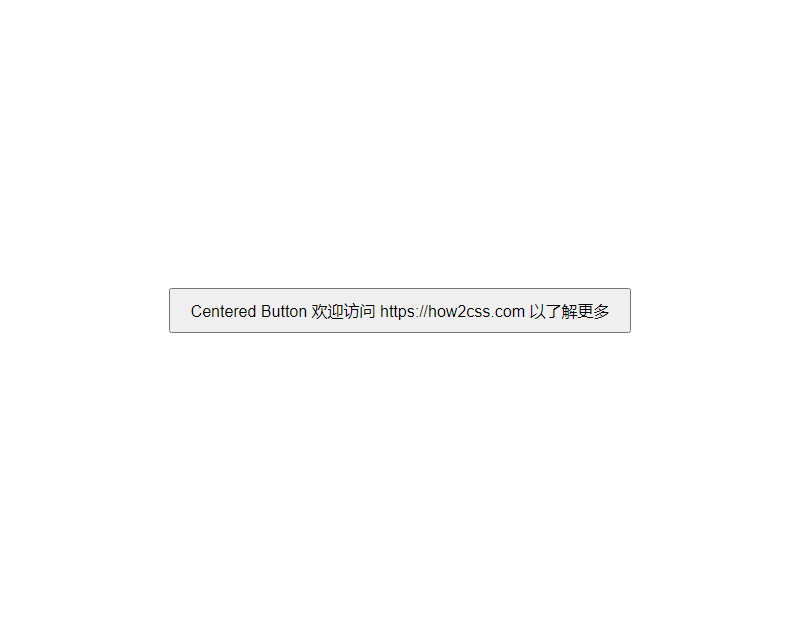
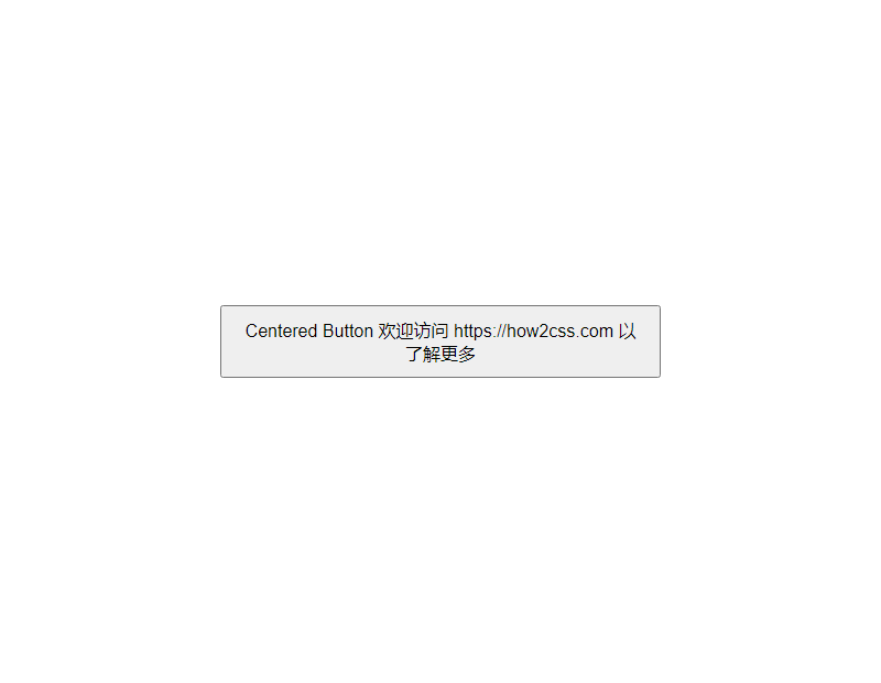
The rendering of executing this code is:

2. To vertically center a button, you can use flex layout or relative positioning. The following is an example using flex layout:
.button-container {
display: flex;
justify-content: center;
align-items: center;
height: 100vh; /* For demonstration purposes, set the container height to the viewport height */
}

.button {
/* Optional styles, customize as needed */
padding: 10px 20px;
background-color: #3498db;
color: #ffffff;
text-decoration: none;
border: none;
}
<!DOCTYPE html>
<html lang="en">
<head>
<meta charset="UTF-8">
<meta name="viewport" content="width=device-width, initial-scale=1.0">
<title>Button Centering</title>
<link rel="stylesheet" href="styles.css">
</head>
<body>
<div class="button-container">
<button class="button">Centered Button</button>
</div>
</body>
</html>
The effect of executing this code is as follows:

3. Centering a Button Horizontally and Vertically
To center a button both horizontally and vertically, you can combine the two methods above. The following is an example using flex layout:
.button-container {
display: flex;
justify-content: center;
align-items: center;
height: 100vh; /* For demonstration purposes, set the container height to the viewport height */
}

.button {
/* Optional styles, customize as needed */
padding: 10px 20px;
background-color: #3498db;
color: #ffffff;
text-decoration: none;
border: none;
}
<!DOCTYPE html>
<html lang="en">
<head>
<meta charset="UTF-8">
<meta name="viewport" content="width=device-width, initial-scale=1.0">
<title>Button Centering</title>
<link rel="stylesheet" href="styles.css">
</head>
<body>
<div class="button-container">
<button class="button">Centered Button</button>
</div>
</body>
</html>
The effect of executing this code is as follows:

4. Centering Buttons for Different Device Sizes
To ensure buttons are properly centered across devices of varying sizes, it’s recommended to use relative units instead of fixed pixels. This allows buttons to be more adaptable across devices. Also, using responsive design ensures that buttons are properly centered across different screen sizes.
When it comes to centering buttons with CSS, best practices involve a variety of approaches, each with its own advantages and disadvantages. The following are several commonly used methods:
- Using Flexbox:
<!DOCTYPE html>
<html lang="en">
<head>
<meta charset="UTF-8">
<meta name="viewport" content="width=device-width, initial-scale=1.0">
<title>Center Button with Flexbox</title>
<style>
body {
display: flex;
justify-content: center;
align-items: center;
height: 100vh;
margin: 0;
}
button {
padding: 10px 20px;
font-size: 16px; }

</style>

</head>

<body>

<button>Centered Button</button>

</body>

</html>
The effect of executing this code is as follows:

This method uses Flexbox layout to center the button horizontally and vertically by setting justify-content: center; and align-items: center; . It’s simple, intuitive, and adapts to screen sizes of all sizes.
- Use Grid layout:
<!DOCTYPE html> <html lang="en"> <head> <meta charset="UTF-8"> <meta name="viewport" content="width=device-width, initial-scale=1.0"> <title>Center Button with Grid Layout</title> <style> body { display: grid; place-items: center; height: 100vh; margin: 0; } button { padding: 10px 20px; font-size: 16px; } </style> </head> <body> <button>Centered <img alt="How to Center a Button with CSS" decoding="async" src="https://coder-cafe.com/wp-content/uploads/2025/09/20240417222227-7.png" title="How to Center a Button with CSS"></p> <p>This method uses Grid Layout to center the button horizontally and vertically using the <code>place-items: center;property. Grid Layout's main advantage over Flexbox is that it provides more layout control options.
- Use absolute positioning:
<!DOCTYPE html> <html lang="en"> <head> <meta charset="UTF-8"> <meta name="viewport" content="width=device-width, initial-scale=1.0"> <title>Absolute Positioning to Center Button</title> <style> body { position: relative; height: 100vh; margin: 0; } button { position: absolute; top: 50%; left: 50%; transform: translate(-50%, -50%); padding: 10px 20px; font-size: 16px; } </style> </head> <body> <button>Centered Button</button> </body> </html>The effect of executing this code is as follows:
This method uses absolute positioning to center the button by aligning its top-left corner with the center of its parent element and then using
transform: translate(-50%, -50%);. While this method can sometimes cause issues in responsive design, it can still be a valid option in some situations.These are some best practices for centering a button. Choose the method that best suits your project's needs, adjusting and optimizing as needed.
Conclusion
Centering a button in CSS is a common requirement in web design, and it can be achieved through a variety of methods. By using flexbox layouts or employing relative positioning and negative margins, we can easily center a button horizontally and vertically within its parent element. These methods are not only simple to understand, but also work well in a variety of situations, providing a consistent user experience.
