Python XlsxWriter – Microchart
Python XlsxWriter – Sparkline Chart
A sparkline chart is a small chart without axes or coordinates. It displays the changes in a parameter. Regular charts are larger, have many explanatory features like titles, legends, and data labels, and are separate from the accompanying text. Sparklines, on the other hand, are smaller and can be embedded in worksheet cells with text or a background.
The sparkline chart feature was introduced by Edward Tufte in 1983. Microsoft introduced it in Excel 2010. You can find the sparkline chart option in the Insert ribbon in Excel.
There are three types of sparkline charts.
- line – Similar to a line chart.
-
column – Similar to a bar chart.
-
win_loss – Whether each value is positive (win) or negative (loss).
Working with Sparkline Charts Using XlsxWriter
The XlsxWriter module has the add_sparkline() method. It essentially takes the cell location of the sparkline chart and the data range to be represented as a sparkline. Optionally, additional parameters such as type and style can be provided as a dictionary object. By default, the type is a line.
Example
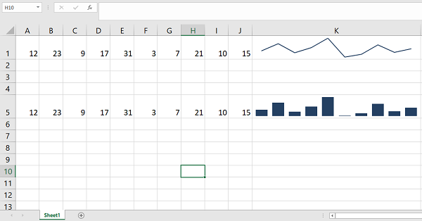
The following program displays the same list of numbers using both row and column sparkline charts.
import xlsxwriter

wb = xlsxwriter.Workbook('hello.xlsx')
ws = wb.add_worksheet()

data=[12,23,9,17,31,3,7,21,10,15]

ws.write_row('A1', data)
ws.set_column('K:K', 40)
ws.set_row(0, 30)
ws.add_sparkline('K1', {'range':'Sheet1!A1:J1'})

ws.write_row('A5', data)
ws.set_column('K:K', 40)
ws.set_row(4, 30)
ws.add_sparkline('K5', {'range':'Sheet1!A5:J5', 'type':'column'})

wb.close()
Output
A microchart has been added to cell K.

These properties are −
- range – is a mandatory parameter. It specifies the range of cell data to be plotted for the microchart.
-
type – specifies the type of microchart. There are three available microchart types: row, column, and win/lose.
-
markers – Enables markers for line micrographs.
-
style – The style of the micrograph defined in MS Excel. There are 36 styles.
-
negative_points – If set to “True,” negative points in the micrograph will be highlighted.
Example
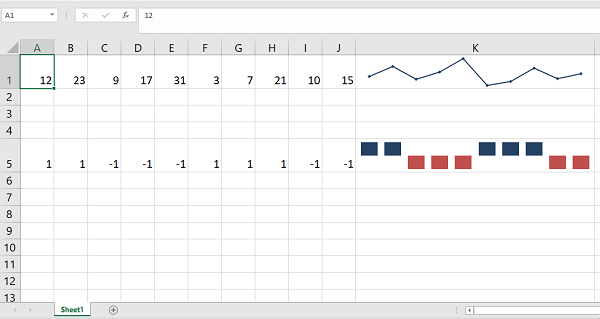
The following program generates a line micrograph with markers and a win-loss micrograph with negative points.
import xlsxwriter

wb = xlsxwriter.Workbook('hello.xlsx')
ws = wb.add_worksheet()

data=[12,23,9,17,31,3,7,21,10,15]
ws.write_row('A1', data)
ws.set_column('K:K', 40)
ws.set_row(0, 30)

data=[1,1,-1,-1,-1,1,1,1,-1,-1]
ws.write_row('A5', data)
ws.set_column('K:K', 40)
ws.set_row(4, 30)
ws.add_sparkline('K1', {'range':'Sheet1!A1:J1', 'markers':True})

ws.add_sparkline('K5', {'range':'Sheet1!A5:J5', 'type':'win_loss',
'negative_points':True})

wb.close()
Output
The line microchart in K1 is marked. The microchart in K5 shows negative points highlighted.

Example – Style Types
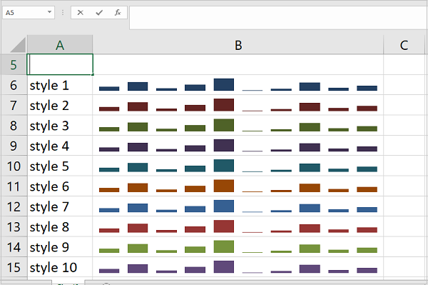
The following code displays a series of numbers in a microline bar chart. Ten different style types are used.
import xlsxwriter

wb = xlsxwriter.Workbook('hello.xlsx')
ws = wb.add_worksheet()

data=[12,23,9,17,31,3,7,21,10,15]
ws.write_row('C3', data)
ws.set_column('B:B',40)

for i in range(1,11):
   ws.write(i+4,0, 'style {}'.format(i))
   ws.add_sparkline(i+4,1,
   {'range':'Sheet1!<span class="katex math inline">C</span>3:<span class="katex math inline">L</span>3',
   'type':'column', 'style':i})

wb.close()
Output
This will produce the following output –
