CSS animation delay: the first one appears before the second one
CSS Animation Delay: First appears before the second
 CSS animation is a very common technique in web design, adding vivid effects to web pages. Animation delay is a method of controlling the start time of an animation, allowing an element to animate after a certain amount of time. In this article, we’ll explain how to use CSS animation delay to achieve the effect of appearing the first element before the second.
1. Using the animation-delay property
The animation-delay property sets an animation delay, causing the animation to begin after a specified amount of time. Here is a simple sample code:</p><div class="eaa-wrapper eaa_after_nth_p eaa_desktop" id="eaa_after_nth_p"><div class="eaa-ad" style=""><div class="aligncenter" style="max-width:336px;">

<ins class="adsbygoogle adsbygoogle-dis" data-ad-client="ca-pub-8722128765990495" data-ad-format="fluid" data-ad-layout="in-article" data-ad-slot="6101954166" style="display:block; text-align:center;"></ins>

<script>/**/

(adsbygoogle = window.adsbygoogle || []).push({});

</script>

</div></div></div>

<pre data-language="HTML"><code class="language-markup line-numbers"><!DOCTYPE html>

<html lang="en">

<head>

<meta charset="UTF-8">

<meta name="viewport" content="width=device-width, initial-scale=1.0">

<title>CSS Animation Delay</title>

<style>

.box {

width: 100px;

height: 100px;

background-color: #f00;

animation: fadeIn 1s forwards;

}
.box2 {
width: 100px;
height: 100px;
background-color: #00f;
animation: fadeIn 1s forwards;
animation-delay: 1s;
}
@keyframes fadeIn {
from {
opacity: 0;
}
to {
opacity: 1;
}
}
</style>
</head>
<body>
<div class="box"></div>
<div class="box2"></div>
</body>
</html>
Output:
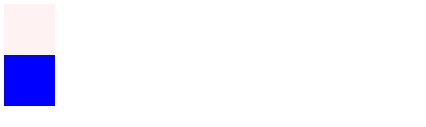
In the example above, we define two div elements, box and box2. Both have the fadeIn animation applied to them. However, box2 has animation-delay: 1s; set, so it delays the animation by one second after the box animation ends.
2. Using JavaScript to Control Animation Delay
In addition to using CSS properties, we can also use JavaScript to control the animation delay effect. Here is a sample code:
<!DOCTYPE html>
<html lang="en">
<head>
<meta charset="UTF-8">
<meta name="viewport" content="width=device-width, initial-scale=1.0">
<title>CSS Animation Delay with JavaScript</title>
<style>
.box {
width: 100px;
height: 100px;
background-color: #f00;
animation: fadeIn 1s forwards;
}

.box2 {
width: 100px;
height: 100px;
background-color: #00f;
animation: fadeIn 1s forwards;
}

@keyframes fadeIn {
from {
opacity: 0;
}
to {
opacity: 1;
}
}
</style>
</head>
<body>
<div class="box"></div>
<div class="box2"></div>
<script>
const box2 = document.querySelector('.box2');
box2.style.animationDelay = '1s';
</script>
</body>
</html>
Output:

In the example above, we use JavaScript to retrieve the box2 element and set the animation delay to 1 second using the style.animationDelay property, achieving the effect of the second element appearing after the first element.
3. Using Multiple Delay Times
Sometimes we may need to set different delay times for different elements. In this case, we can use multiple animation-delay properties. Here is a sample code:
<!DOCTYPE html>
<html lang="en">
<head>
<meta charset="UTF-8">
<meta name="viewport" content="width=device-width, initial-scale=1.0">
<title>CSS Animation Delay with Multiple Delays</title>
<style>
.box {
width: 100px;
height: 100px;
background-color: #f00;
animation: fadeIn 1s forwards;
}

.box2 {
width: 100px;
height: 100px;
background-color: #00f;
animation: fadeIn 1s forwards;
animation-delay: 1s;
} .box3 {
width: 100px;
height: 100px;
background-color: #0f0;
animation: fadeIn 1s forwards;
animation-delay: 2s;
}

@keyframes fadeIn {
from {
opacity: 0;
}
to {
opacity: 1;
}
}
</style>

</head>

<body>
<div class="box"></div>
<div class="box2"></div>
<div class="box3"></div>

</body>

</html>
Output:

In the above example, we define three div elements: box, box2, and box3. The fadeIn animation is applied to each of them. However, box2 and box3 each have a different animation-delay property set, resulting in the effect of multiple elements appearing with varying delays.
4. Using Keyframe Animation to Control Delay
In addition to using the animation-delay property, we can also use keyframe animations to control the animation delay effect. Here is a sample code:
<!DOCTYPE html>
<html lang="en">
<head>
<meta charset="UTF-8">
<meta name="viewport" content="width=device-width, initial-scale=1.0">
<title>CSS Animation Delay with Keyframes</title>
<style>
.box {
width: 100px;
height: 100px;
background-color: #f00;
animation: fadeIn 1s forwards;
}

.box2 {
width: 100px;
height: 100px;
background-color: #00f;
animation: fadeIn2 1s forwards;
}

@keyframes fadeIn {
0% {
opacity: 0; }
50% {
opacity: 1;
}
100% {
opacity: 1;
}
}

@keyframes fadeIn2 {
0% {
opacity: 0;
}
50% {
opacity: 0;
}
100% {
opacity: 1;
}
}
</style>
</head>
<body>
<div class="box"></div>
<div class="box2"></div>
</body>
</html>
Output:

In the example above, we define two div elements, box and box2. Keyframe animations named fadeIn and fadeIn2 are applied to each, respectively. By setting the percentage of the keyframe animation to control the appearance of the elements, we achieve the effect of the first element appearing before the second.
Through the example code above, we can see how to use CSS animation delay to achieve the effect of the first element appearing before the second. This effect can be easily achieved using the animation-delay property, JavaScript control, multiple delay times, or keyframe animations.