CSS background gradients
CSS Background Gradient

In web design, background gradient is a common effect that can make the page look more beautiful and attractive. Using CSS’s background gradient properties, we can create various gradient effects, such as linear gradients and radial gradients. This article will provide a detailed introduction to background gradients in CSS, along with sample code.
Linear Gradient
A linear gradient is a gradient effect that moves from one direction to another. In CSS, we can use the linear-gradient() function to create a linear gradient. Here’s a simple linear gradient example:
<!DOCTYPE html>
<html lang="en">
<head>
<meta charset="UTF-8">
<meta name="viewport" content="width=device-width, initial-scale=1.0">
<title>Linear Gradient Example</title>
<style>
.linear-gradient {
width: 200px;
height: 200px;
background: linear-gradient(to right, #ffcccc, #cc99ff);
}
</style>
</head>
<body>
<div class="linear-gradient"></div>
</body>
</html>
Output:

In the example code above, we define a div element with a width and height of 200px and set a linear gradient effect on the background from left to right, starting with a color of #ffcccc and ending with a color of #cc99ff. After running the code, you can see that the background of the div element has a linear gradient effect.
Radial Gradient
A radial gradient is a gradient effect that moves from a central point outwards. In CSS, we can use the radial-gradient() function to implement radial gradients. Here’s a simple radial gradient example:
<!DOCTYPE html>
<html lang="en">
<head>
<meta charset="UTF-8">
<meta name="viewport" content="width=device-width, initial-scale=1.0">
<title>Radial Gradient Example</title>
<style>
.radial-gradient {
width: 200px;
height: 200px;
background: radial-gradient(circle, #ffcccc, #cc99ff);
}
</style>
</head>
<body>
<div class="radial-gradient"></div>
</body>
</html>
Output:

In the example code above, we define a div element with a width and height of 200px and set a radial gradient effect for the background, fading from the center of the circle to the surrounding edges. The starting color is #ffcccc and the ending color is #cc99ff. After running the code, you can see that the background of the div element displays a radial gradient effect.
Gradient Direction
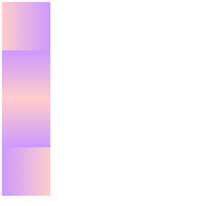
For linear and radial gradients, we can achieve different gradient effects by setting different directions. Below is a sample code demonstrating linear gradient effects in different directions:
<!DOCTYPE html>
<html lang="en">
<head>
<meta charset="UTF-8">
<meta name="viewport" content="width=device-width, initial-scale=1.0">
<title>Gradient Direction Example</title>
<style>
.gradient-direction {
width: 200px;
height: 200px;
background: linear-gradient(to right, #ffcccc, #cc99ff);
}
.gradient-direction.top {
background: linear-gradient(to top, #ffcccc, #cc99ff);
}
.gradient-direction.bottom {
background: linear-gradient(to bottom, #ffcccc, #cc99ff);
}
.gradient-direction.left {
background: linear-gradient(to left, #ffcccc, #cc99ff);
}
</style>
</head>
<body>
<div class="gradient-direction"></div>
<div class="gradient-direction top"></div>
<div class="gradient-direction bottom"></div>
<div class="gradient-direction left"></div>
</body>
</html>
Output:

In the example code above, we define a div element with a width and height of 200px and set linear gradient effects in different directions: right to left, top to bottom, bottom to top, and left to right. By setting different directions, you can achieve different gradient effects.
Gradient Color Stops
In a gradient, you can set multiple color stops to create a richer gradient effect. The following is a sample code demonstrating the linear gradient effect of setting multiple color points:
<!DOCTYPE html>
<html lang="en">
<head>
<meta charset="UTF-8">
<meta name="viewport" content="width=device-width, initial-scale=1.0">
<title>Gradient Color Stops Example</title>
<style>
.gradient-color-stops {
width: 200px;
height: 200px;
background: linear-gradient(to right, #ffcccc, #cc99ff, #99ccff);
}
</style>
</head>
<body>
<div class="gradient-color-stops"></div>
</body>
</html>
Output:

In the example code above, we define a div element with a width and height of 200px and set a linear gradient effect with three color stops: #ffcccc, #cc99ff, and #99ccff. By setting multiple color stops, you can achieve a more colorful gradient effect.
Gradient Angle
In a linear gradient, we can control the direction of the gradient by setting the angle. Below is a sample code demonstrating the linear gradient effect with different angles:
<!DOCTYPE html>
<html lang="en">
<head>
<meta charset="UTF-8">
<meta name="viewport" content="width=device-width, initial-scale=1.0">
<title>Gradient Angle Example</title>
<style>
.gradient-angle {
width: 200px;
height: 200px;
background: linear-gradient(45deg, #ffcccc, #cc99ff);
}
</style>
</head>
<body>
<div class="gradient-angle"></div>
</body>
</html>
Output:

In the example code above, we define a div element with a width and height of 200px and set a 45-degree linear gradient effect, starting with a color of #ffcccc and ending with a color of #cc99ff. By setting different angles, you can achieve gradient effects in different directions.
Gradient Size
In radial gradients, we can control the gradient range by setting the size. Here’s a sample code demonstrating setting different sizes for a radial gradient effect:
<!DOCTYPE html>
<html lang="en">
<head>
<meta charset="UTF-8">
<meta name="viewport" content="width=device-width, initial-scale=1.0">
<title>Gradient Size Example</title>
<style>
.gradient-size {
width: 200px;
height: 200px;
background: radial-gradient(circle, #ffcccc, #cc99ff);
}
.gradient-size.ellipse {
background: radial-gradient(ellipse, #ffcccc, #cc99ff);
}
</style>
</head>
<body>
<div class="gradient-size"></div>
<div class="gradient-size ellipse"></div>
</body>
</html>
Output:

In the example code above, we define a div element with a width and height of 200px and set a circular and elliptical radial gradient effect, starting with a color of #ffcccc and ending with a color of #cc99ff. By setting different sizes, you can achieve different gradient ranges.
Gradient Repeat
In gradients, we can achieve a repeating gradient effect by setting the repeating-linear-gradient() and repeating-radial-gradient() functions. Here is a sample code demonstrating repeating linear and radial gradient effects:
<!DOCTYPE html>
<html lang="en">
<head>
<meta charset="UTF-8">
<meta name="viewport" content="width=device-width, initial-scale=1.0">
<title>Repeating Gradient Example</title>
<style>
.repeating-linear-gradient {
width: 200px;
height: 200px;
background: repeating-linear-gradient(to right, #ffcccc, #cc99ff 20px);
}
.repeating-radial-gradient {
width: 200px;
height: 200px;
background: repeating-radial-gradient(circle, #ffcccc, #cc99ff 20px);
}
</style>
</head>
<body>
<div class="repeating-linear-gradient"></div>
<div class="repeating-radial-gradient"></div>
</body>
</html>
Output:

In the example code above, we define a div element with a width and height of 200px and set a repeating linear gradient and radial gradient effect, repeating every 20px. By setting a repeating gradient, you can create more interesting and unique effects.
Gradient Transparency
In a gradient, you can create a transparent effect by setting the transparency of the colors. Here is a sample code demonstrating a linear gradient effect with transparency:
<!DOCTYPE html>
<html lang="en">
<head>
<meta charset="UTF-8">
<meta name="viewport" content="width=device-width, initial-scale=1.0">
<title>Gradient Opacity Example</title>
<style>
.gradient-opacity {
width: 200px;
height: 200px;
background: linear-gradient(to right, rgba(255, 204, 204, 0.5), rgba(204, 153, 255, 0.5));
}
</style>
</head>
<body>
<div class="gradient-opacity"></div>
</body>
</html>
Output:

In the example code above, we define a div element with a width and height of 200px and set a linear gradient effect with transparency. The starting color is rgba(255, 204, 204, 0.5) and the ending color is rgba(204, 153, 255, 0.5). By setting the transparency, we can achieve a gradient transparency effect.
Combining Gradient Angle and Size
With radial gradients, we can combine angle and size to achieve richer effects. Here’s a sample code demonstrating a radial gradient effect using angle and size:
<!DOCTYPE html>
<html lang="en">
<head>
<meta charset="UTF-8">
<meta name="viewport" content="width=device-width, initial-scale=1.0">
<title>Gradient Angle and Size Example</title>
<style>
.gradient-angle-size {
width: 200px;
height: 200px;
background: radial-gradient(45deg, circle, #ffcccc, #cc99ff);
}
</style>
</head>
<body>
<div class="gradient-angle-size"></div>

</body>

</html>
In the example code above, we define a div element with a width and height of 200px. We then apply a radial gradient effect with a 45-degree angle and a circular size, starting with a color of #ffcccc and ending with a color of #cc99ff. By combining angles and sizes, you can create more colorful gradient effects.
Gradient Colors
With gradients, we can use different colors to create a variety of dazzling effects. Here is an example code demonstrating a linear gradient effect using multiple colors:
<!DOCTYPE html>
<html lang="en">
<head>
<meta charset="UTF-8">
<meta name="viewport" content="width=device-width, initial-scale=1.0">
<title>Gradient Colors Example</title>
<style>
.gradient-colors {
width: 200px;
height: 200px;
background: linear-gradient(to right, #ffcccc, #cc99ff, #99ccff, #ffcc99);
}
</style>
</head>
<body>
<div class="gradient-colors"></div>

</body>

</html>
Output:

In the example code above, we define a div element with a width and height of 200px and set a linear gradient effect with four colors: #ffcccc, #cc99ff, #99ccff, and #ffcc99. By using different colors, you can create a variety of colorful gradient effects.
Combining Gradient Repeat and Transparency
In gradients, we can combine repeat and transparency to create more complex effects. Here’s a sample code demonstrating a linear gradient effect with repeat and opacity:
<!DOCTYPE html>
<html lang="en">
<head>
<meta charset="UTF-8">
<meta name="viewport" content="width=device-width, initial-scale=1.0">
<title>Repeating Gradient and Opacity Example</title>
<style>
.repeating-gradient-opacity {
width: 200px;
height: 200px;
background: repeating-linear-gradient(to right, rgba(255, 204, 204, 0.5), rgba(204, 153, 255, 0.5) 20px);
}
</style>
</head>
<body>
<div class="repeating-gradient-opacity"></div>
</body>
</html>
Output:

In the example code above, we define a 200px wide and high div element and combine it with a linear gradient effect with repeat and transparency settings. The gradient repeats every 20px, with a starting color of rgba(255, 204, 204, 0.5) and an ending color of rgba(204, 153, 255, 0.5). By combining repeat and transparency settings, more complex gradient effects can be achieved.