CSS sets the position of the element in the lower right corner
CSS sets the position of the element in the lower right corner

In web design, sometimes we need to position an element in the bottom right corner of the page to make it look more beautiful and neat. This article will show you how to achieve this effect using CSS.
1. Using Absolute Positioning
A common method is to use absolute positioning to position an element in the bottom right corner. This can be achieved by setting the element’s position property to absolute and then setting the bottom and right properties to 0.
<!DOCTYPE html>
<html lang="en">
<head>
<meta charset="UTF-8">
<meta name="viewport" content="width=device-width, initial-scale=1.0">
<title>Right Bottom Position</title>
<style>
.right-bottom {
position: absolute;
bottom: 0;
right: 0;
background-color: #f00;
color: #fff;
padding: 10px;
}

</style>

</head>

<body>
<div class="right-bottom">geek-docs.com</div>

</body>

</html>
In the example above, we create a div element, assign it a class name of right-bottom, and then position it in the bottom right corner of the page using CSS. Running this example code, you’ll see geek-docs.com displayed in the bottom right corner of the page.
2. Using Flex Layout
Another common method is to use Flex Layout to achieve the bottom right position of an element. We can control the horizontal and vertical alignment of elements by setting the parent element’s display property to flex and using the justify-content and align-items properties.
<!DOCTYPE html>
<html lang="en">
<head>
<meta charset="UTF-8">
<meta name="viewport" content="width=device-width, initial-scale=1.0">
<title>Right Bottom Position</title>
<style>
.container {
display: flex;
justify-content: flex-end;
align-items: flex-end;
height: 100vh;
}
.right-bottom {
background-color: #00f;
color: #fff;
padding: 10px;
}
</style>
</head>
<body>
<div class="container">
<div class="right-bottom">geek-docs.com</div>

</div>

</body>

</html>
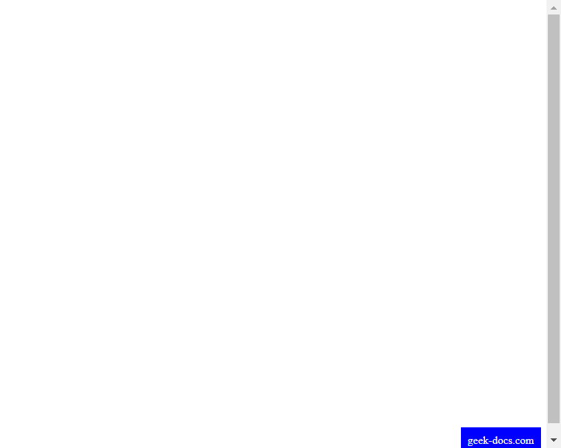
Code Run Results:

In the above example, we create a parent element, div, and assign it a class named container. Then, we assign a class named right-bottom to the child element, div, and use Flex layout to position it in the bottom right corner of the page. Running this example code will display geek-docs.com in the bottom right corner of the page.
3. Using Grid Layout
In addition to Flex Layout, we can also use Grid Layout to position elements in the lower right corner. Set the parent element’s display property to grid and use the justify-items and align-items properties to control the horizontal and vertical alignment of elements.
<!DOCTYPE html>
<html lang="en">
<head>
<meta charset="UTF-8">
<meta name="viewport" content="width=device-width, initial-scale=1.0">
<title>Right Bottom Position</title>
<style>
.container {
display: grid;
justify-items: end;
align-items: end;
height: 100vh;
}
.right-bottom {
background-color: #0f0;
color: #fff;
padding: 10px;
}
</style>
</head>
<body>
<div class="container">
<div class="right-bottom">geek-docs.com</div>
</div>
</body>
</html>
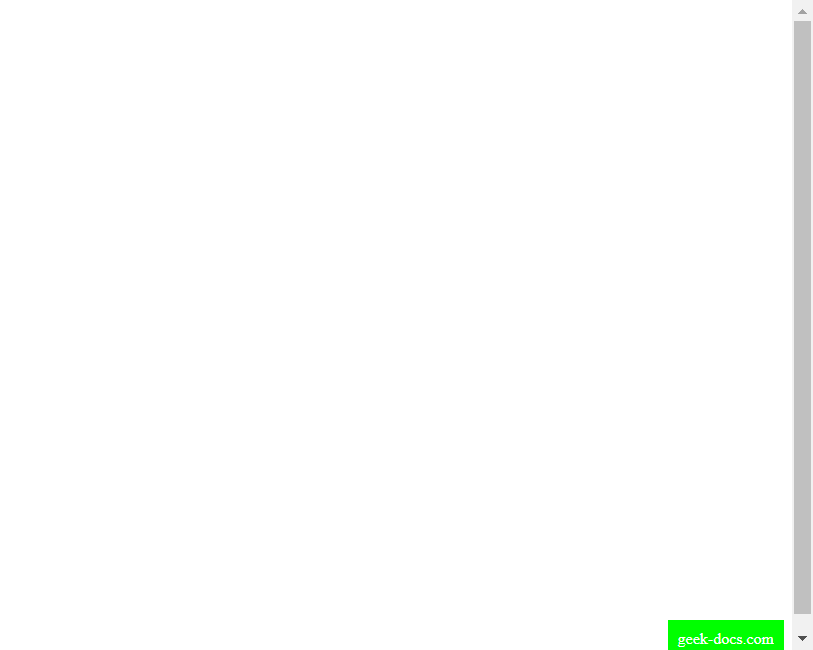
Code Running Result:

In the example above, we create a parent element, a div, and assign it a class called container. Then, we assign a class called right-bottom to the child element, positioning it in the bottom right corner of the page using Grid layout. Running this example code, you’ll see geek-docs.com displayed in the bottom right corner of the page.
4. Using Absolute Positioning and the Transform Property
Another method is to use absolute positioning and the transform property to achieve the bottom right position of an element. We can adjust the position of an element by setting its position property to absolute and then using the translate function of the transform property.
<!DOCTYPE html>
<html lang="en">
<head>
<meta charset="UTF-8">
<meta name="viewport" content="width=device-width, initial-scale=1.0">
<title>Right Bottom Position</title>
<style>
.right-bottom {
position: absolute;
bottom: 0;
right: 0;
background-color: #f0f;
color: #fff;
padding: 10px;
transform: translate(-100%, 100%);
}
</style>
</head>
<body>
<div class="right-bottom">geek-docs.com</div>

</body>

</html>
In the example above, we created a div element, added a class named right-bottom to it, and then used CSS to position it in the lower-right corner of the page. Using the translate function in the transform attribute, we moved the element to the upper left, achieving the lower-right corner effect. Running this example code, you’ll see geek-docs.com displayed in the lower-right corner of the page.
5. Using Absolute Positioning and the Calc Function
Another way to achieve the lower-right position is to use absolute positioning and the Calc function. We can do this by setting the element’s position property to absolute and then using the Calc function to calculate the element’s position.
<!DOCTYPE html>
<html lang="en">
<head>
<meta charset="UTF-8">
<meta name="viewport" content="width=device-width, initial-scale=1.0">
<title>Right Bottom Position</title>
<style>
.right-bottom {
position: absolute;
bottom: 0;
right: 0;
background-color: #ff0;
color: #000;
padding: 10px;
margin-bottom: calc(100vh - 40px);
margin-right: calc(100vw - 100px);
}
</style>
</head>
<body>
<div class="right-bottom">geek-docs.com</div>

</body>

</html>
In the example above, we created a div element, assigned it a class named right-bottom, and then used CSS to position it in the lower right corner of the page. Using the calc function, we calculated the values of the element’s margin-bottom and margin-right properties to achieve the lower-right corner effect. Running this example code, you’ll see geek-docs.com displayed in the lower-right corner of the page.
Through these methods, we can easily position an element in the lower-right corner of a page, achieving both flexibility and aesthetics in the page layout.