CSS style adaptive resolution
CSS Style Adaptive Resolution

In web design, different devices have different screen resolutions. To ensure that web pages can display properly on different devices, we need to use CSS styles to achieve adaptive resolution. This article will explain how to use CSS to make web page styles adapt to different resolutions.
1. Using Media Queries
Media queries are a key feature in CSS3 that allow you to apply different styles based on device characteristics. Using media queries, you can set different styles based on device resolution, making web pages adaptable to different devices.
Sample code:
/* Apply the following styles when the device width is less than 600px */
@media only screen and (max-width: 600px) {
body {
background-color: lightblue;
}
}

/* Apply the following styles when the device width is greater than 600px */
@media only screen and (min-width: 601px) {
body {
background-color: lightgreen;
}
}
In the example code above, we use media queries to apply different background colors based on the device width.
2. Using Percentage Layout
Using percentage layout is a common method for achieving adaptive web page design. By setting properties like width and height as percentages, you can automatically resize an element based on the size of its parent element, thus achieving adaptive web page design at different resolutions.
Sample code:
<!DOCTYPE html>
<html>
<head>
<style>
.container {
width: 80%;
margin: 0 auto;
background-color: lightblue;
}
.box {
width: 50%;
height: 100px;
background-color: lightgreen;
}
</style>

</head>

<body>
<div class="container">
<div class="box"></div>

</div>

</body>

</html>
Code Running Results:

In the example code above, we use percentage layout to set the width of the container and box so that they can automatically resize according to the size of the browser window.
3. Use rem units
The rem unit is relative to the font size of the root element (the html element). Using rem units allows web pages to adapt to different resolutions. When the root element’s font size changes, the sizes of all elements using rem units will adjust accordingly.
Sample code:
html {
font-size: 16px;
}

.container {
width: 20rem;
height: 10rem;
background-color: lightblue;
}
In the above example code, we set the root element’s font size to 16px and then use rem units to set the container’s width and height, allowing it to automatically resize based on the root element’s font size.
4. Use vw and vh units
The vw unit represents a percentage of the viewport width, while the vh unit represents a percentage of the viewport height. Using vw and vh units allows web pages to adapt to different resolutions. When the viewport width or height changes, the size of elements using vw and vh units will also change accordingly.
Sample code:
.container {
width: 50vw;
height: 50vh;
background-color: lightblue;
}
In the example code above, we use the vw unit to set the container’s width to 50% of the viewport width and the vh unit to set the container’s height to 50% of the viewport height, thereby achieving adaptive webpage effects at different resolutions.
5. Using Flex Layout
Flex layout is a flexible layout model in CSS3. By using flex layout, webpages can be adaptive to different resolutions. Flex layout allows child elements within a container to automatically adjust their position and size based on the device size, achieving adaptive webpage effects.
Sample code:
<!DOCTYPE html>
<html>
<head>
<style>
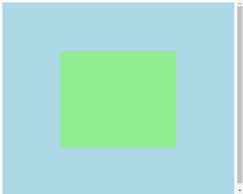
.container {
display: flex;
justify-content: center;
align-items: center;
height: 100vh;
background-color: lightblue;
}
.box {
width: 50%;
height: 50%;
background-color: lightgreen;
}
</style>
</head>
<body>
<div class="container">
<div class="box"></div>
</div>
</body>
</html>
Code running results:

In the example code above, we use flex layout to set the position and size of the container and box, allowing them to automatically adjust their position and size according to the size of the device.
6. Using Grid Layout
Grid layout is a grid layout model in CSS3. By using grid layout, web pages can be adapted to different resolutions. Grid layout arranges child elements in a container in a grid pattern, achieving a web page that is adaptive.
Sample code:
<!DOCTYPE html>
<html>
<head>
<style>
.container {
display: grid;
grid-template-columns: 1fr 1fr 1fr;
grid-gap: 10px;
background-color: lightblue;
}
.box {
background-color: lightgreen;
}
</style>
</head>
<body>
<div class="container">
<div class="box">Box 1</div>
<div class="box">Box 2</div>
<div class="box">Box 3</div> </div>
</body>
</html>
Code Runtime Results:

In the example code above, we use the grid layout to set the arrangement of containers and boxes so that they automatically adjust their position and size according to the size of the device.
7. Using max-width and min-width
Using the max-width and min-width properties allows elements to adapt to different resolutions. The max-width property limits the maximum width of an element, while the min-width property limits the minimum width. By setting these two properties, an element can automatically adjust its size to different resolutions.
Sample Code:
.container {
max-width: 800px;
min-width: 400px;
margin: 0 auto;
background-color: lightblue;
}
In the above example code, we use the max-width and min-width properties to set the maximum and minimum widths of the container, allowing it to automatically resize at different resolutions.
8. Using the @viewport Rule
The @viewport rule is a CSS3 rule that can be used to set viewport properties. By using the @viewport rule, you can achieve adaptive webpage effects at different resolutions. The @viewport rule can set viewport properties such as width, height, and zoom, thereby achieving adaptive webpage effects.
Sample Code:
@viewport {
width: device-width;
height: device-height;
zoom: 1.0;
}
In the above sample code, we use the @viewport rule to set the viewport’s width and height to the device’s width and height, and also set the zoom to 1.0, thereby achieving adaptive webpage response at different resolutions.
9. Use Responsive Image Layout
In web design, https://coder-cafe.com/wp-content/uploads/2025/09/images are often one of the most important elements on a webpage. Using responsive image layouts can help achieve adaptive image response at different resolutions. By setting the image’s maximum width to 100%, the image automatically resizes based on the size of its parent element, achieving adaptive image response.
Sample Code:
<!DOCTYPE html>
<html>
<head>
<style>
img {
max-width: 100%;
height: auto;
}
</style>
</head>
<body>
<img src="https://www.geek-docs.com/https://coder-cafe.com/wp-content/uploads/2025/09/image.jpg" alt="Geek Docs">
</body>
</html>
Code Runtime Results:

In the example code above, we set the image’s maximum width to 100%, allowing it to automatically resize based on the size of its parent element, thus achieving adaptive effects at different resolutions.
10. Use Responsive Fonts
Fonts are also an important element in web design. Using responsive fonts can help achieve adaptive effects at different resolutions. By setting the font size to relative units (such as em or rem), the font automatically resizes based on the size of the parent element, achieving adaptive effects.
Sample Code:
body {
font-size: 1rem;
}

h1 {
font-size: 2rem;
}

p {
font-size: 1.2rem;
}
In the above example code, we set the font size to relative units (rem), allowing it to automatically adjust based on the root element’s font size, thus achieving font responsiveness at different resolutions.
Through the above example code, we’ve demonstrated how to use CSS styles to achieve responsiveness at different resolutions. By using media queries, percentage layout, rem units, vw and vh units, flex layout, grid layout, max-width and min-width, the @viewport rule, responsive image layout, and responsive font layout, we can ensure that web pages display properly on different devices and improve the user experience.