How to center a div with CSS
How to Center a Div with CSS
Reference: how to center a div with CSS
Centering elements is a common requirement in modern web design, especially for the <div> element. CSS provides a variety of methods to achieve this, each with its own applicable scenarios and caveats.
In HTML and CSS, centering an element typically involves horizontal centering and vertical centering. Horizontal centering means the element is horizontally centered within its container, while vertical centering means the element is vertically centered.
One way to achieve horizontal centering is to use margin: auto;. By setting left and right margins to auto, the browser will automatically center the element horizontally. Another common approach is to use text-align: center; to center text content within a container, but this only works for inline elements and text.
Vertical centering is often more challenging because the HTML/CSS box model is often inflexible in this regard. A common approach is to set the container’s display property to flex and use align-items: center; to achieve vertical centering. Another approach is to use absolute positioning and the transform property, but this can require more complex layouts.
Whichever method you choose, ensure that the elements are centered while still maintaining a responsive and maintainable layout. Here’s a simple example showing how to horizontally and vertically center a <div> element:
<!DOCTYPE html>
<html lang="en">
<head>
<meta charset="UTF-8">
<meta name="viewport" content="width=device-width, initial-scale=1.0">
<title>Centering a Div with CSS</title>
<style>
.container {
display: flex;
justify-content: center;
align-items: center;
height: 100vh; /* 100% viewport height */
}
.centered-div {
width: 200px;
height: 200px;
background-color: #f0f0f0;
text-align: center;
line-height: 200px; /* For vertical centering of text */
}
</style>
</head>
<body>
<div class="container">
<div class="centered-div">
Centered Content
</div>
</div>
</body>
</html>
The effect of executing this code is as follows:
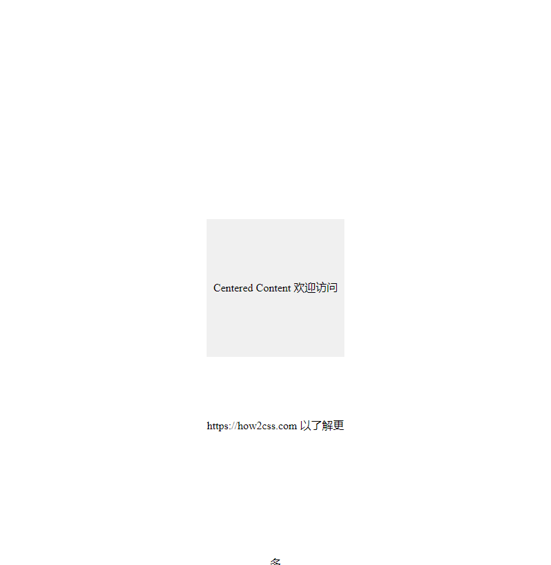
This example uses a flexbox layout to achieve horizontal and vertical centering, and places some centered content within an inner <div>.
In Using Flexbox Layout
Flexbox is a powerful layout model that makes it easy to center elements. Here’s a sample code:
<!DOCTYPE html>
<html lang="en">
<head>
<meta charset="UTF-8">
<meta name="viewport" content="width=device-width, initial-scale=1.0">
<title>Flexbox Centering</title>
<style>
.container {
display: flex;
justify-content: center; /* Horizontally centered */
align-items: center; /* Vertically centered */
height: 100vh; /* Fills the entire viewport height */
}
</style>
</head>
<body>

<div class="container">
<div>This is centered using Flexbox!</div>

</div>

</body>

</html>
The effect of executing this code is as follows:

In this example, .container uses Flexbox layout and centers its contents horizontally and vertically using the justify-content: center; and align-items: center; properties. This approach is simple, intuitive, and works well in most cases.
Using Grid Layout
Grid Layout is another powerful CSS layout model that provides more flexible control over element positioning. Here’s an example of centering using Grid layout:
<!DOCTYPE html>
<html lang="en">
<head>
<meta charset="UTF-8">
<meta name="viewport" content="width=device-width, initial-scale=1.0">
<title>Grid Centered</title>
<style>
.container {
display: grid;
place-items: center; /* Center child elements horizontally and vertically */
height: 100vh; /* Fill the entire viewport height */
}
</style>
</head>
<body>

<div class="container">
<div>This is centered using Grid!</div>

</div>

</body>

</html>
The effect of executing this code is as follows:
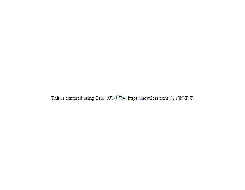
In this example, .container uses Grid layout and centers its contents horizontally and vertically using the place-items: center; property. This approach is simple and straightforward, and suitable for situations where more flexible layout control is required.
Using Absolute Positioning
You can also use absolute positioning to center a div. While this approach may require more code than using Flexbox or Grid, it can still be useful in certain situations. Here’s an example:
<!DOCTYPE html>
<html lang="en">
<head>
<meta charset="UTF-8">
<meta name="viewport" content="width=device-width, initial-scale=1.0">
<title>Absolutely Centered</title>
<style>
.container {
position: relative;
height: 100vh; /* Fills the entire viewport height */
}
.centered {
position: absolute;
top: 50%;
left: 50%;
transform: translate(-50%, -50%);
}
</style>
</head>
<body>

<div class="container">
<div class="centered">This is centered using absolute Positioning!</div>

</div>

</body>

</html>
The effect of executing this code is as follows:
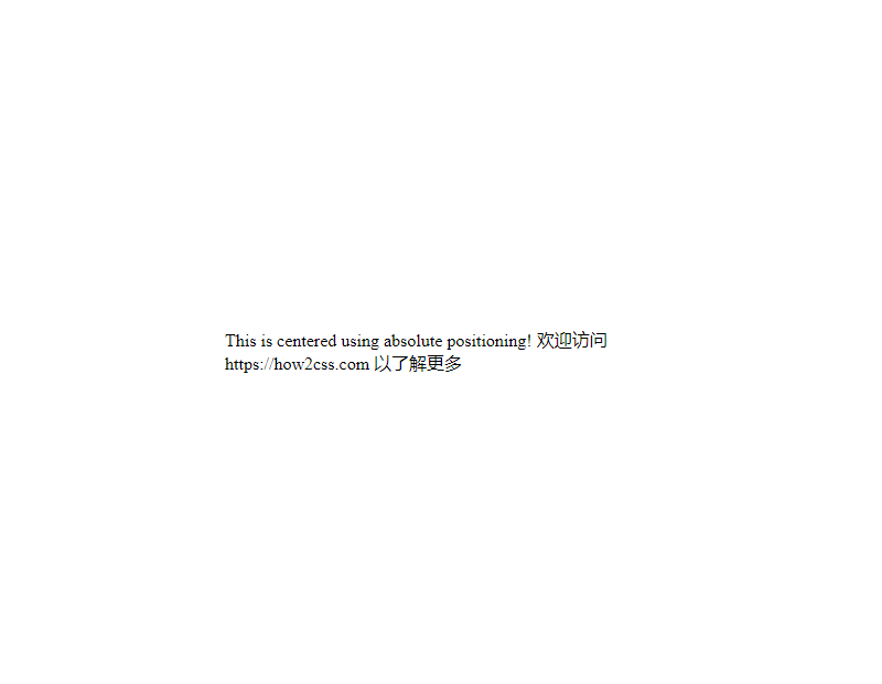
In this example, the .centered element uses absolute positioning and centers itself within its parent container using top: 50%;, left: 50%;, and transform: translate(-50%, -50%);.
These are several common techniques for centering a Div in CSS. Choosing the right method depends on your specific needs and preferences.
Common Problems and Solutions
Problem:
How do I center a div with CSS?
Solution:
In web design and development, horizontally and vertically centering div elements is a common requirement. This can be achieved in a variety of ways, and I’ll introduce a few common methods below.
Method 1: Using Flexbox
Flexbox is a powerful layout method that makes it easy to center elements. Here’s a simple example:
<!DOCTYPE html>
<html lang="en">
<head>
<meta charset="UTF-8">
<meta name="viewport" content="width=device-width, initial-scale=1.0">
<title>Flexbox Centering Example</title>
<style>
.container {
display: flex;
justify-content: center;
align-items: center;
height: 100vh; /* Make the container fill the entire viewport */
}
.content {
width: 200px;
height: 100px;
background-color: #f0f0f0;
}
</style>
</head>
<body>

<div class="container">
<div class="content">
<!-- Place your content here -->
</div>

</div>

</body>

</html>
The effect of executing this code is as follows:

In this example, we set the display property of .container to flex and then use justify-content: center; and align-items: center; to center the content horizontally and vertically.
Method 2: Using Grid Layout
Grid Layout is another powerful layout method that also makes it easy to center elements. Here’s an example:
<!DOCTYPE html>
<html lang="en">
<head>
<meta charset="UTF-8">
<meta name="viewport" content="width=device-width, initial-scale=1.0">
<title>Grid Centering Example</title>
<style>
.container {
display: grid;
place-items: center;
height: 100vh; /* Make the container fill the entire viewport */
}
.content {
width: 200px;
height: 100px;
background-color: #f0f0f0;
}
</style>
</head>
<body>

<div class="container">
<div class="content">
<!-- Place your content here -->
</div>

</div>

</body>

</html>
The following image shows the effect of executing this code:

In this example, we set the display property of the .container to grid and then use place-items: center; to center the content horizontally and vertically.
Method 3: Using Absolute Positioning and the Transform Attribute
If you need to support older browsers, you can also use absolute positioning and the transform attribute to achieve centering. Here’s an example:
<!DOCTYPE html>
<html lang="en">
<head>
<meta charset="UTF-8">
<meta name="viewport" content="width=device-width, initial-scale=1.0">
<title>Absolute Positioning and Centering Example</title>
<style>
.container {
position: relative;
height: 100vh; /* Make the container fill the entire viewport */
}
.content {
position: absolute;
top: 50%;
left: 50%;
transform: translate(-50%, -50%);
width: 200px;
height: 100px;
background-color: #f0f0f0;
}

</style>

</head>

<body>

<div class="container">
<div class="content">
<!-- Place your content here -->

</div>

</div>

</body>

</html>
The following image shows the effect of executing this code:

In this example, we set the .content element to absolute positioning and use top: 50%; left: 50%; to position it in the center of the container. We then use transform: translate(-50%, -50%); to achieve horizontal and vertical centering.
These are several common methods. You can choose the appropriate method to achieve centering of div elements based on your project requirements and browser compatibility.
In this best practices section, we’ll explore how to center a div element using CSS. Centering a div is very common in web design, both horizontally and vertically. We’ll discuss two methods: using Flexbox and using traditional margin properties.
Centering with Flexbox:
Flexbox is a powerful layout model that makes it easy to center elements. Here’s a simple example showing how to use Flexbox to center a div horizontally and vertically:
<!DOCTYPE html>
<html lang="en">
<head>
<meta charset="UTF-8">
<meta name="viewport" content="width=device-width, initial-scale=1.0">
<title>Flexbox Centering</title>
<style>
body, html {
height: 100%;
margin: 0;
display: flex;
justify-content: center;
align-items: center;
}
.centered-div {
width: 200px;
height: 200px;
background-color: #f0f0f0;
}

</style>

</head>

<body>

<div class="centered-div">

<!-- Your content here -->

</div>

</body>

</html>
The effect of executing this code is as follows:

In this example, we set the display property of the body and html to flex and use the justify-content and align-items properties to center the content horizontally and vertically. We then created a div with a fixed width and height and applied the .centered-div style to it.
Using the traditional margin property to achieve center alignment:
Another common approach is to use the traditional margin property. By setting the left and right margins and the top and bottom margins of the div to auto, you can achieve horizontal and vertical center alignment.
<!DOCTYPE html>
<html lang="en">
<head>
<meta charset="UTF-8">
<meta name="viewport" content="width=device-width, initial-scale=1.0">
<title>Margin Centering</title>
<style>
body, html {
height: 100%;
margin: 0;
}
.centered-div {
width: 200px;
height: 200px;
background-color: #f0f0f0;
margin: auto;
}
</style>
</head>
<body>
<div class="centered-div">
<!-- Your content here -->
</div>
</body>
</html>
The effect of executing this code is as follows:
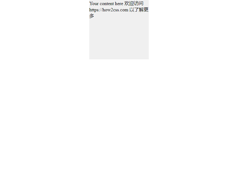
In this example, we set the margin property of .centered-div to auto, which will center it both horizontally and vertically.
Both methods are common and effective ways to center a Div. Developers can choose the appropriate method based on their specific needs and project circumstances.
Conclusion
In this article, we explored different methods and techniques for centering a Div with CSS. By using Flexbox, Grid, and traditional horizontal and vertical centering techniques, we’ve demonstrated a variety of practical code examples and analyzed their real-world application scenarios. These techniques provide developers with flexible and reliable solutions for both responsive design and cross-browser compatibility. By studying this article, developers can better understand how to implement CSS centering layouts, thereby improving the quality and efficiency of their web design and development.