What is inline-block in CSS
What is an inline block in css
Reference:what is inline block in css
Inline-block elements in CSS are block-level by default, but behave as inline elements under certain circumstances. This behavior typically occurs when certain CSS properties are set, such as display: inline-block;. Inline-block elements possess the characteristics of both block-level and inline elements, can be arranged horizontally, and can have set width, height, and vertical alignment. In layout design, inline-block elements are often used to create horizontally arranged groups of elements while maintaining the characteristic of each element occupying its own line.
In CSS, inline-block is a layout technique that allows elements to be arranged like inline elements while having the properties of block-level elements. This makes inline-blocks useful for creating horizontally arranged groups of elements or inserting block-level elements into the flow of text. Here’s a detailed code example showing how to use inline-blocks to create a simple horizontal navigation bar:
<!DOCTYPE html>
<html lang="en">
<head>
<meta charset="UTF-8">
<meta name="viewport" content="width=device-width, initial-scale=1.0">
<title>Horizontal Navigation Bar</title>
<style>
/* Clear default styles */
body, ul {
margin: 0;
padding: 0;
list-style: none;
}
/* Horizontal navigation bar container */
.navbar {
background-color: #333;
overflow: hidden;
}
/* Navigation links */
.navbar a {
display: inline-block;
padding: 14px 20px;
color: white;
text-decoration: none;
}
/* Hover style */
.navbar a:hover {
background-color: #ddd;
color: black;
}
</style>
</head>
<body>

<div class="navbar">
Home
About
Services
Contact
</div>

</body>
</html>
The effect of executing this code is as follows:

In this example, the .navbar class defines the navigation bar’s style, giving it a black background and hiding overflow. The .navbar a class defines the styles for the navigation links, making them appear as inline-blocks with appropriate padding, white text, and no decoration. When the mouse hovers over the link, the background and text colors change, providing interactivity. This example clearly demonstrates the key functionality of inline-blocks: the flexibility and control they provide when arranging elements horizontally.
Common Problems and Solutions
Question: What is inline-block in CSS?
In CSS, inline-block is a CSS display property that allows elements to be displayed like block-level elements while maintaining the characteristics of inline elements. This means that inline-block elements can be displayed on the same line and can have properties such as width, height, padding, and margins set, similar to block-level elements, while still retaining the non-wrapping characteristics of inline elements.
Solution: How to Use inline-block in CSS?
To use inline-block in CSS, you can do so by setting the display property to inline-block. Here’s a simple example:
.inline-block {
display: inline-block;
width: 200px; /* Set width */
height: 100px; /* Set height */
background-color: #f0f0f0;
margin: 10px; /* Set margin */
padding: 5px; /* Set padding */
}
In HTML, apply the .inline-block class to an element to render it as an inline-block:
<div class="inline-block">

This is an inline-block element.

</div>
This creates an inline-block element with the specified width, height, background color, and margins. By adjusting properties like width, height, margin, and padding, you can customize the appearance and layout of inline-block elements.
Notes: Some Considerations When Using Inline-Blocks
- Text Baseline Alignment: Inline-block elements are aligned to the text baseline by default, so some whitespace may be left when they are laid out. You can use the
vertical-alignproperty to adjust the vertical alignment of the element within the line. -
Whitespace Between Inline-Block Elements: In HTML, whitespace between inline-block elements (such as spaces, line breaks, etc.) will result in extra whitespace when rendered. This can be addressed by removing whitespace between inline-block elements or using the CSS
font-size: 0technique. -
Compatibility Issues: In some older browsers, inline-block elements may behave differently, requiring special handling or compatibility fixes. You can use CSS hacks or specific browser prefixes to address compatibility issues.
By understanding the characteristics and considerations of inline-block elements, developers can more effectively utilize CSS inline-block properties to achieve various layout needs and ensure consistent page appearance and layout across browsers and devices.
Best Practices
In actual development, using CSS inline-block best practices can improve code maintainability and performance. Here are some suggestions:
1. Minimize the use of inline blocks
While CSS inline blocks can be useful in some situations, overuse can lead to cluttered and difficult-to-maintain code. Therefore, when designing your pages, minimize their use and rely more on external style sheets.
2. Choose the right scenarios for inline blocks
In some cases, using CSS inline blocks can improve page load performance, especially for small styles. For example, when a style is only used once on a specific element, inlining it to that element can reduce HTTP requests, thereby increasing load times.
3. Integrate with browser caching
If the styles on a page change frequently, using inline blocks is not recommended, as each change will cause the entire page to reload. Instead, place styles in external style sheets and integrate with browser caching so that styles can be loaded from cache when the same page is visited multiple times, improving performance.
4. Pay attention to code structure and maintainability
Even when using CSS inline blocks, ensure your code is clearly structured and easy to maintain. Use comments and appropriate naming to help other developers understand the purpose and structure of your code.
Here is a simple example demonstrating how to use CSS inline blocks in HTML:
<!DOCTYPE html>
<html lang="en">
<head>
<meta charset="UTF-8">
<meta name="viewport" content="width=device-width, initial-scale=1.0">
<title>Inline CSS Example</title>
</head>
<body>
<div style="background-color: #f0f0f0; padding: 20px;">
<h1 style="color: #333; text-align: center;">Welcome to our website!</h1>
<p style="font-size: 16px; line-height: 1.5; text-align: justify;">
This is an example of using inline CSS to style HTML elements. Inline CSS can be useful for small, one-off styles.
</p>
<button style="background-color: #007bff; color: #fff; padding: 10px 20px; border: none; border-radius: 5px; cursor: pointer;">Learn More</button>
</div>
</body>
</html>
The effect of executing this code is as follows:
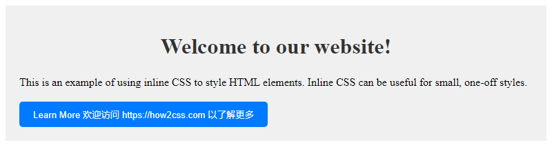 In this example, we used inline styles to style the
 <div>, <h1>, <p>, and <button> elements. This approach works well for simple styles, but for more complex styles, it’s better to use an external style sheet.
Conclusion
In CSS, inline blocks are a powerful layout tool that can create multi-column layouts, mixed text and https://coder-cafe.com/wp-content/uploads/2025/09/images, and responsive designs without using additional HTML elements. By using inline blocks wisely, developers can improve the maintainability and accessibility of their web pages while reducing unnecessary code redundancy. The flexibility and ease of use of inline blocks make them an indispensable part of modern web development.