Seaborn multi-panel classification chart
Seaborn Multi-Panel Categorical Plots
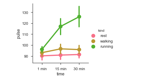
Categorical data can be visualized using two plot types: the pointplot() function or the higher-level factorplot() function.
Factorplot
Factorplot draws a categorical plot on a FacetGrid. Using the ‘kind’ parameter, we can choose between boxplot, violinplot, barplot, and stripplot plots. FacetGrid uses dotplots by default.
Examples
import pandas as pd
import seaborn as sb
from matplotlib import pyplot as plt
df = sb.load_dataset('exercise')
sb.factorplot(x = "time", y = pulse", hue = "kind",data = df);
plt.show()
Output

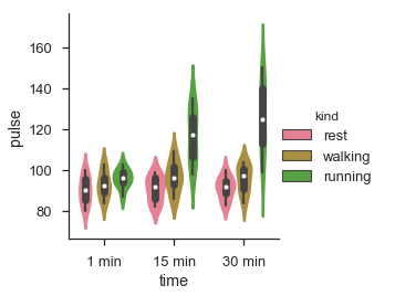
We can visualize the same data using different plots using the category argument.
Example
import pandas as pd
import seaborn as sb
from matplotlib import pyplot as plt
df = sb.load_dataset('exercise')
sb.factorplot(x = "time", y = "pulse", hue = "kind", kind = 'violin', data = df);
plt.show()
Output

In factorplot, data is plotted on a faceted grid.
What is a faceted grid?
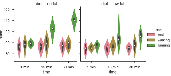
Facet grid A facet grid forms a matrix of panels defined by rows and columns by partitioning the variables. Because of the panels, a single plot looks like multiple plots. It is very helpful for analyzing all possible combinations of two discrete variables.
Let’s illustrate the above definition with an example.
Example
import pandas as pd
import seaborn as sb
from matplotlib import pyplot as plt
df = sb.load_dataset('exercise')
sb.factorplot(x = "time", y = "pulse", hue = "kind", kind = 'violin', col = "diet", data = df);
plt.show()
Output

The benefit of using Facet is that we can include another variable in the plot. The plot above is split into two plots based on a third variable, “diet,” using the “col” argument.
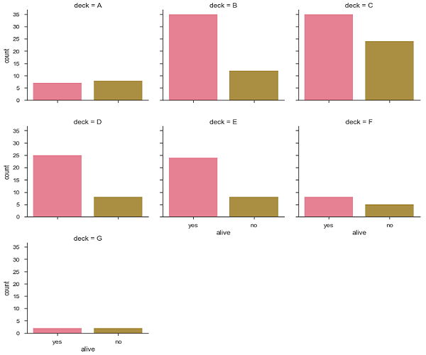
We can create many column facets and align them with the rows of the grid:
Example
import pandas as pd
import seaborn as sb
from matplotlib import pyplot as plt
df = sb.load_dataset('titanic')
sb.factorplot("alive", col = "deck", col_wrap = 3, data = df[df.deck.notnull()], kind = "count")
plt.show()
Output:
