Seaborn statistical estimation
Statistical Estimation with Seaborn
In most cases, we’re dealing with estimates of the entire distribution of data. But when it comes to estimating central tendency, we need a specific way to summarize the distribution. The mean and median are very commonly used techniques for estimating the central tendency of a distribution.
In all the plots we learned in the previous section, we visualized the entire distribution. Now, let’s discuss plots that can be used to estimate the central tendency of a distribution.
Histograms
Histograms ( ) show the relationship between categorical and continuous variables. Data are represented by rectangular bars, and the length of the bar represents the proportion of data in that category.
Bar charts represent estimates of central tendency. Let’s use the “Titanic” dataset to learn about histograms.
Examples
import pandas as pd
import seaborn as sb
from matplotlib import pyplot as plt
df = sb.load_dataset('titanic')
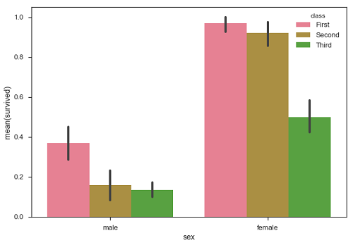
sb.barplot(x = "sex", y = "survived", hue = "class", data = df)
plt.show()
Output

In the example above, we can see the average number of males and females surviving in each category. From the plot, we can see that more females survived than males. Among both males and females, more survivors came from the first category.
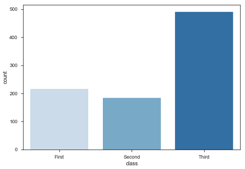
A special case of a histogram is to display the number of observations in each category, rather than calculating statistics for a second variable. To do this, we use countplot().
Examples
import pandas as pd
import seaborn as sb
from matplotlib import pyplot as plt
df = sb.load_dataset('titanic')
sb.countplot(x = " class ", data = df, palette = "Blues");
plt.show()
Output
 import pandas as pd
import seaborn as sb
from matplotlib import pyplot as plt
df = sb.load_dataset('titanic')
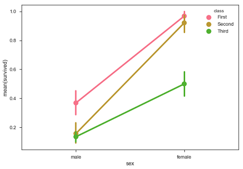
sb.pointplot(x = "sex", y = "survived", hue = "class", data = df)
plt.show()
Output
