Seaborn Visualization of Pairwise Relationships
Visualizing Pairwise Relationships with Seaborn
Real-time datasets contain many variables. In such cases, it’s important to analyze the relationships between each variable. Plotting bivariate distributions for (n,2) pairs can be a complex and time-consuming process.
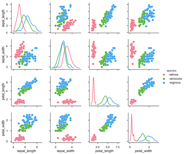
To plot multiple pairwise bivariate distributions in a dataset, use the pairplot() function. This function displays the relationships for (n,2) pairs of variables in a data frame as a matrix plot, with diagonal plots as univariate plots.
Axes
In this section, we’ll learn what axes are, their usage, parameters, and more.
Usage
seaborn.pairplot(data,…)
Parameters
The following table lists the axis parameters.
| Sequence Number: Sr.No. | Parameters and Description |
|---|---|
| 1 | Data Framework |
| 2 | Hue Variable in the data used to map plot aspects to different colors. |
| 3 | Palette A set of colors used to map the Hue variable |
| 4 | Kind Plot type for non-identity relationships. {‘scatter’, ‘reg’} |
| 5 | diag_kind The kind of plot to use for the diagonal subplots. {‘hist’, ‘kde’} |
Except for the data, all other arguments are optional. pairplot accepts several other arguments. The ones mentioned above are the most commonly used ones.
Examples
import pandas as pd
import seaborn as sb
from matplotlib import pyplot as plt
df = sb.load_dataset('iris')
sb.set_style("ticks")
sb.pairplot(df,hue = 'species',diag_kind = "kde",kind = "scatter",palette = "husl")
plt.show()
Output

We can observe the changes in each plot. These plots are in matrix format, with row names representing the X-axis and column names representing the Y-axis.
The diagonal plot is a kernel density plot, and the other plots are scatter plots, as described above.