CSS Flex vertical layout full height
CSS Flex Vertical Layout Height Full

In web page layout, you often encounter situations where you need to make the height of an element fill the entire parent container. Using CSS Flex layout can easily achieve this requirement. This article will introduce in detail how to use CSS Flex layout to achieve vertical layout and make the height of the element fill the entire parent container.
1. Using flex-direction: column to achieve vertical layout
First, we need to set the parent container’s flex-direction property to column, which will cause the child elements to lay out vertically. Next, we can use flex: 1 to make the child elements fill the entire parent container.
<!DOCTYPE html>
<html lang="en">
<head>
<meta charset="UTF-8">
<meta name="viewport" content="width=device-width, initial-scale=1.0">
<title>Flex Vertical Layout Full Height</title>
<style>
.container {
display: flex;
flex-direction: column;
height: 300px;
}
.item {
flex: 1;
background-color: lightblue;
}
</style>
</head>

<body>
<div class="container">
<div class="item">Item 1</div>
<div class="item">Item 2</div>
<div class="item">Item 3</div>
</div>

</body>

</html>
Output:

In the above example, we create a parent container .container and set its flex-direction to column with a height of 300px. The child element .item uses flex: 1 to make it take up the entire height of the parent container. After running the code, you’ll see that all three child elements take up the entire height of the parent container.
2. Use align-items: stretch to make child elements take up the entire height of their parent container.
In addition to using flex: 1 to make child elements take up the entire height of their parent container, we can also use align-items: stretch to achieve the same effect.
<!DOCTYPE html>
<html lang="en">
<head>
<meta charset="UTF-8">
<meta name="viewport" content="width=device-width, initial-scale=1.0">
<title>Flex vertical layout takes up full height</title>
<style>
.container {
display: flex;
flex-direction: column;
align-items: stretch;
height: 300px;
}
.item {
background-color: lightblue;
}
</style>
</head>
<body>
<div class="container">
<div class="item">Item 1</div>
<div class="item">Item 2</div>
<div class="item">Item 3</div>
</div>
</body>
</html>
Output:
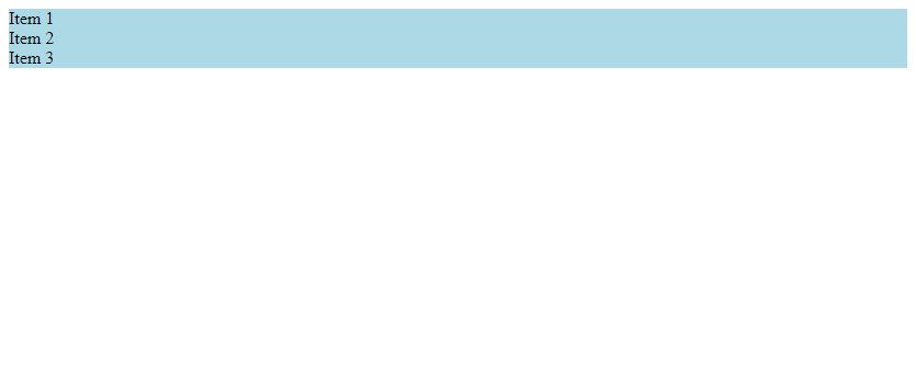
In the above example, we set the align-items property of the parent container .container to stretch. This will cause the child elements to automatically fill the entire parent container. After running the code, you’ll see that all three child elements fill the entire parent container.
3. Using flex-grow: 1 to Make Child Elements Fill the Entire Container
Another common method is to use flex-grow: 1 to make the child elements fill the entire parent container.
<!DOCTYPE html>
<html lang="en">
<head>
<meta charset="UTF-8">
<meta name="viewport" content="width=device-width, initial-scale=1.0">
<title>Flex vertical layout takes up full height</title>
<style>
.container {
display: flex;
flex-direction: column;
height: 300px;
}
.item {
flex-grow: 1;
background-color: lightblue;
}
</style>
</head>
<body>
<div class="container">
<div class="item">Item 1</div>
<div class="item">Item 2</div>
<div class="item">Item 3</div>

</div>

</body>

</html>
Output:
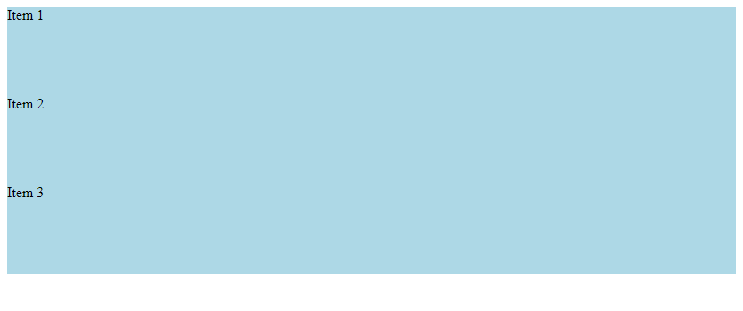
In the example above, we set the flex-grow property of the .item child element to 1. This automatically causes the child element to take up the entire height of its parent container. After running the code, you’ll see that all three child elements take up the entire height of their parent container.
4. Use min-height: 100% to make child elements take up the entire height of their parent container.
In addition to using the Flex property, we can also use min-height: 100% to make child elements take up the entire height of their parent container.
<!DOCTYPE html>
<html lang="en">
<head>
<meta charset="UTF-8">
<meta name="viewport" content="width=device-width, initial-scale=1.0">
<title>Flex vertical layout takes up full height</title>
<style>
.container {
display: flex;
flex-direction: column;
height: 300px;
}
.item {
min-height: 100%;
background-color: lightblue;
}
</style>
</head>
<body>
<div class="container">
<div class="item">Item 1</div>
<div class="item">Item 2</div>
<div class="item">Item 3</div>
</div>
</body>
</html>
Output:
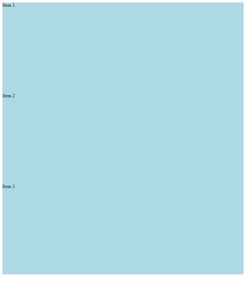
In the example above, we set the min-height property of the .item child element to 100%. This way, the child elements automatically take up the entire height of their parent container. After running the code, you’ll see that all three child elements take up the entire height of their parent container.
5. Using the vh Unit to Achieve Full Vertical Height
Another common method is to use the vh unit to achieve full vertical height.
<!DOCTYPE html>
<html lang="en">
<head>
<meta charset="UTF-8">
<meta name="viewport" content="width=device-width, initial-scale=1.0">
<title>Flex vertical layout takes up full height</title>
<style>
.container {
display: flex;
flex-direction: column;
height: 100vh;
}
.item {
background-color: lightblue;
}
</style>
</head>
<body>
<div class="container">
<div class="item">Item 1</div>
<div class="item">Item 2</div>
<div class="item">Item 3</div>
</div>
</body>
</html>
Output:
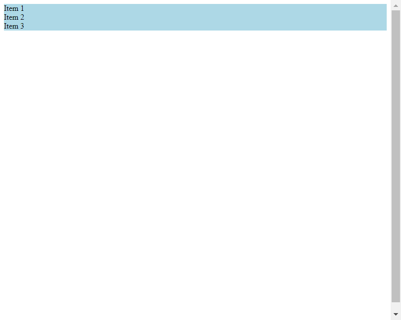
In the above example, we set the height of the parent container .container to 100vh. This way, the child elements automatically fill the entire parent container. After running the code, you can see that the height of all three child elements fills the entire parent container.
6. Using the calc() Function to Achieve Full Vertical Height
In addition to using the vh unit, we can also use the calc() function to achieve full vertical height.
<!DOCTYPE html>
<html lang="en">
<head>
<meta charset="UTF-8">
<meta name="viewport" content="width=device-width, initial-scale=1.0">
<title>Flex vertical layout takes up full height</title>
<style>
.container {
display: flex;
flex-direction: column;
height: calc(100vh - 20px);
}
.item {
background-color: lightblue;
}
</style>
</head>
<body>
<div class="container">
<div class="item">Item 1</div>
<div class="item">Item 2</div>
<div class="item">Item 3</div>

</div>

</body>

</html>
Output:
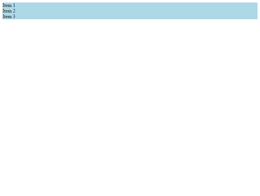
In the example above, we use calc(100vh - 20px) to calculate the height of the parent container .container. This way, the child elements automatically take up the entire height of the parent container. After running the code, you can see that the height of all three child elements takes up the entire height of the parent container.
7. Use flex-wrap: wrap to achieve full vertical layout height
If the number of child elements exceeds the height of the parent container, we can use flex-wrap: wrap to achieve full vertical layout height.
<!DOCTYPE html>
<html lang="en">
<head>
<meta charset="UTF-8">
<meta name="viewport" content="width=device-width, initial-scale=1.0">
<title>Flex vertical layout takes up full height</title>
<style>
.container {
display: flex;
flex-direction: column;
flex-wrap: wrap;
height: 300px;
}
.item {
flex: 1;
background-color: lightblue;
}
</style>
</head>
<body>
<div class="container">
<div class="item">Item 1</div>
<div class="item">Item 2</div>
<div class="item">Item 3</div>
<div class="item">Item 4</div>
<div class="item">Item 5</div>
</div>

</body>

</html>
Output:

In the example above, we set the flex-wrap property of the parent container .container to wrap. This will cause the child elements to automatically fill the entire parent container. Even if the number of child elements exceeds the parent container’s height, they will automatically wrap. After running the code, you’ll see that all child elements now occupy the entire height of their parent container.
8. Use align-self: stretch to make a single child element occupy the entire height of its parent container.
Sometimes, we just need to make a single child element occupy the entire height of its parent container. We can use align-self: stretch to achieve this.
<!DOCTYPE html>
<html lang="en">
<head>
<meta charset="UTF-8">
<meta name="viewport" content="width=device-width, initial-scale=1.0">
<title>Flex vertical layout takes up full height</title>
<style>
.container {
display: flex;
flex-direction: column;
height: 300px;
}
.item {
background-color: lightblue;
}
.item:nth-child(2) {
align-self: stretch;
}
</style>
</head>
<body>
<div class="container">
<div class="item">Item 1</div>
<div class="item">Item 2</div>
<div class="item">Item 3</div>
</div>
</body>
</html>
Output:

In the above example, we use align-self: stretch to make the height of the second child element .item:nth-child(2) full of the parent container. The height of other child elements still adapts to the content. After running the code, you can see that the height of the second child element fills the entire parent container.
9. Use flex-grow: 2 to Implement Height-Proportional Layout
Sometimes we need to distribute the heights of different child elements in a certain proportion. We can use the flex-grow property to achieve this.
<!DOCTYPE html>
<html lang="en">
<head>
<meta charset="UTF-8">
<meta name="viewport" content="width=device-width, initial-scale=1.0">
<title>Flex vertical layout takes up full height</title>
<style>
.container {
display: flex;
flex-direction: column;
height: 300px;
}
.item {
background-color: lightblue;
}
.item:nth-child(1) {
flex-grow: 1;
}
.item:nth-child(2) {
flex-grow: 2;
} .item:nth-child(3) {
flex-grow: 3;
}
</style>
</head>
<body>
<div class="container">
<div class="item">Item 1</div>
<div class="item">Item 2</div>
<div class="item">Item 3</div>
</div>
</body>
</html>
Output:
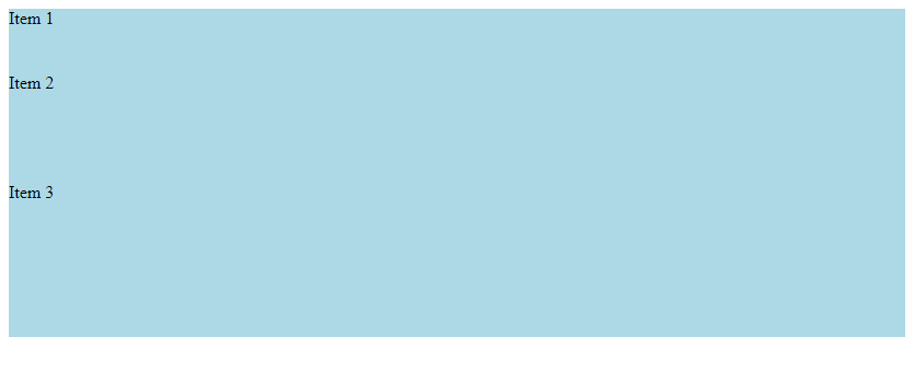
In the above example, we set different flex-grow values for the three child .item elements: 1, 2, and 3, indicating that their heights are distributed in a 1:2:3 ratio. After running the code, you can see that the heights of the three child elements are distributed according to the set ratio.
10. Using flex: 1 1 auto to Implement Full Height Layout
Finally, we can use flex: 1 1 auto to achieve a full height layout, so that the child elements automatically fill the entire parent container.
<!DOCTYPE html>
<html lang="en">
<head>
<meta charset="UTF-8">
<meta name="viewport" content="width=device-width, initial-scale=1.0">
<title>Flex vertical layout takes up full height</title>
<style>
.container {
display: flex;
flex-direction: column;
height: 300px;
}
.item {
flex: 1 1 auto;
background-color: lightblue;
}
</style>
</head>
<body>
<div class="container">
<div class="item">Item 1</div>
<div class="item">Item 2</div>
<div class="item">Item 3</div>

</div>

</body>

</html>
Output:

In the example above, we set the flex property of the .item child element to 1 1 auto. This way, the child elements automatically fill the entire parent container. After running the code, you’ll see that all three child elements fill the entire parent container.