CSS scrolling table
CSS Scrolling Table

In web development, we often encounter situations where we need to display large amounts of data, and tables are a common way to display them. However, when a table contains a large amount of data, the page becomes very long, requiring users to scroll continuously to view all the content. To improve the user experience, we can use CSS to implement a scrolling effect in the table, allowing users to view the table content within a fixed-size area.
1. Basic Scrolling Table
First, let’s create a basic scrolling table. In this example, we’ll use a fixed-size div container to wrap the table and set the overflow property to auto. This will create a scroll bar when the table content exceeds the container size.
<!DOCTYPE html>
<html lang="en">
<head>
<meta charset="UTF-8">
<meta name="viewport" content="width=device-width, initial-scale=1.0">
<title>Scrollable Table</title>
<style>
.table-container {
width: 300px;
height: 200px;
overflow: auto;
}
table {
width: 100%;
border-collapse: collapse;
}
th, td {
border: 1px solid #ddd;
padding: 8px;
text-align: left;
}
</style>
</head>
<body>
<div class="table-container">
<table>
<tr>
<th>Header 1</th>
<th>Header 2</th>
<th>Header 3</th>
</tr>
<tr>
<td>Row 1 Data 1</td>
<td>Row 1 Data 2</td> <td>Row 1 Data 3</td>
</tr>
<tr>
<td>Row 2 Data 1</td>
<td>Row 2 Data 2</td>
<td>Row 2 Data 3</td>
</tr>
<!-- Repeat rows for more data -->
</table>
</div>
</body>
</html>
Code Running Results:

In this example, we create a fixed size of 300px * A table is placed within a 200px div container. When the table content exceeds the container size, horizontal and vertical scroll bars appear, allowing the user to scroll through all the content.
2. Horizontally Scrollable Table
Sometimes, a table with many columns is desirable, but the page width is limited. In these cases, a horizontally scrollable table can be used to present data. In this example, the table is placed within a fixed-width div container and the overflow-x property is set to auto. This causes a horizontal scroll bar to appear when the table columns exceed the container width.
<!DOCTYPE html>
<html lang="en">
<head>
<meta charset="UTF-8">
<meta name="viewport" content="width=device-width, initial-scale=1.0">
<title>Horizontal Scrollable Table</title>
<style>
.table-container {
width: 300px;
overflow-x: auto;
}
table {
width: 1000px; /* Set a large width for demonstration */
border-collapse: collapse;
}
th, td {
border: 1px solid #ddd;
padding: 8px;
text-align: left;
}
</style>
</head>
<body>
<div class="table-container">
<table>
<tr>
<th>Header 1</th>
<th>Header 2</th>
<th>Header 3</th>
<!-- Repeat headers for more columns -->
</tr>
<tr>
<td>Row 1 Data 1</td>
<td>Row 1 Data 2</td>
<td>Row 1 Data 3</td>
<!-- Repeat data for more columns -->
</tr>
<!-- Repeat rows for more data -->
</table>
</div>
</body>
</html>
Code running results:

In this example, we create a div container with a fixed width of 300px and place a 1000px wide table within it. When the number of table columns exceeds the container’s width, a horizontal scroll bar appears, allowing the user to scroll through all columns.
3. Fixed Header and Scrollable Table
Sometimes, we want a table header to remain fixed at the top of the page while the table content remains scrollable. In this example, we place the table header in a separate div container and set its position to sticky. This way, the header remains fixed to the top of the page as the user scrolls.
<!DOCTYPE html>
<html lang="en">
<head>
<meta charset="UTF-8">
<meta name="viewport" content="width=device-width, initial-scale=1.0">
<title>Fixed Header Scrollable Table</title>
<style>
.table-container {
width: 300px;
height: 200px;
overflow: auto;
}
table {
width: 100%;
border-collapse: collapse;
}
th, td {
border: 1px solid #ddd;
padding: 8px;
text-align: left;
}
.header-container {
position: sticky; top: 0;
background-color: #f1f1f1;
}
</style>
</head>
<body>
<div class="header-container">
<table>
<tr>
<th>Header 1</th>
<th>Header 2</th>
<th>Header 3</th>
</tr>
</table>
</div>
<div class="table-container">
<table>
<tr>
<td>Row 1 Data 1</td>
<td>Row 1 Data 2</td>
<td>Row 1 Data 3</td>
</tr>
<tr>
<td>Row 2 Data 1</td>
<td>Row 2 Data 2</td>
<td>Row 2 Data 3</td>
</tr>
<!-- Repeat rows for more data -->
</table>
</div>
</body>
</html>
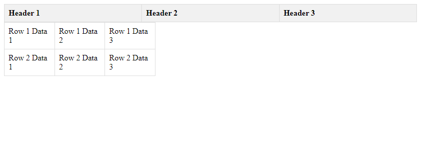
Result of running the code:

In this example, we place the table header in a separate div container and set its position to sticky and its top to 0. This will keep the header fixed at the top of the page. Users can scroll to view all the data.
4. Fixed Column Scrollable Table
Sometimes, we want to keep one column of a table fixed to the left side of the page, while allowing the other columns to be scrolled. In this example, we divide the table into two parts, a fixed column on the left and a scrollable column on the right, and use CSS to achieve the fixed column effect.
<!DOCTYPE html>
<html lang="en">
<head>
<meta charset="UTF-8">
<meta name="viewport" content="width=device-width, initial-scale=1.0">
<title>Fixed Column Scrollable Table</title>
<style>
.table-container {
width: 300px;
overflow: auto;
}
table {
width: 100%;
border-collapse: collapse;
}
th, td {
border: 1px solid #ddd;
padding: 8px;
text-align: left;
}
.fixed-column {
position: sticky;
left: 0;
background-color: #f1f1f1;
}
</style>
</head>
<body>
<div class="table-container">
<table>
<tr>
<th class="fixed-column">Fixed Header</th>
<th>Header 1</th>
<th>Header 2</th>
<th>Header 3</th>
</tr>
<tr>
<td class="fixed-column">Fixed Column 1</td>
<td>Row 1 Data 1</td>
<td>Row 1 Data 2</td>
<td>Row 1 Data 3</td>
</tr>
<tr>
<td class="fixed-column">Fixed Column 2</td>
<td>Row 2 Data 1</td>
<td>Row 2 Data 2</td>
<td>Row 2 Data 3</td>
</tr>
<!-- Repeat rows for more data -->
</table>
</div>
</body>
</html>
Code Running Results:

In this example, we divide the table into a fixed column on the left and a scrollable column on the right. By setting the fixed column’s position to sticky and its left to 0, we achieve a fixed column effect. Users can scroll the right column to view all the data, while the left column remains fixed to the left side of the page.
5. Customizing Scrolling Table Styles
Beyond the basic scrolling table effects, we can also use CSS styles to customize the table’s appearance, making it more aesthetically pleasing and tailored to our design needs. In this example, we’ll add some styles to the table, such as background color, border style, and font color.
<!DOCTYPE html>
<html lang="en">
<head>
<meta charset="UTF-8">
<meta name="viewport" content="width=device-width, initial-scale=1.0">
<title>Custom Style Scrollable Table</title>
<style>
.table-container {
width: 300px;
height: 200px;
overflow: auto;
}
table {
width: 100%;
border-collapse: collapse;
background-color: #f9f9f9;
}
th, td {
border: 1px solid #ccc;
padding: 8px;
text-align: center;
color: #333; }
th {
background-color: #f1f1f1;
}
</style>
</head>
<body>
<div class="table-container">
<table>
<tr>
<th>Header 1</th>
<th>Header 2</th>
<th>Header 3</th>
</tr>
<tr>
<td>Row 1 Data 1</td>
<td>Row 1 Data 2</td>
<td>Row 1 Data 3</td>
</tr>
<tr>
<td>Row 2 Data 1</td>
<td>Row 2 Data 2</td>
<td>Row 2 Data 3</td>
</tr>
<!-- Repeat rows for more data --> </table>

</div>

</body>

</html>
Code Runtime Results:

In this example, we added styles such as background color, border style, and font color to the table to make it look more beautiful. Users can scroll to view all the content, and the table style also meets the design requirements.
Through the above examples, we can see how to use CSS to achieve different types of scrolling table effects and customize the table style according to actual needs, improving the user experience and page aesthetics.