CSS Style Library
CSS style library

1. Bootstrap
Bootstrap is a popular front-end framework that provides a rich set of CSS styles and JavaScript components to help developers quickly build responsive web pages. Here’s a simple example code demonstrating how to use Bootstrap’s button styles:
<!DOCTYPE html>
<html lang="en">
<head>
<meta charset="UTF-8">
<meta name="viewport" content="width=device-width, initial-scale=1.0">
<link rel="stylesheet" href="https://cdn.jsdelivr.net/npm/bootstrap@5.3.0/dist/css/bootstrap.min.css">
<title>Bootstrap Button Example</title>
</head>
<body>
<button class="btn btn-primary">Primary Button</button>
<button class="btn btn-secondary">Secondary Button</button>
<button class="btn btn-success">Success Button</button>

</body>

</html>
Output:

In the example code above, we import Bootstrap’s CSS file and use the button styles provided by Bootstrap. After running the code, you should see three buttons with different styles.
2. Tailwind CSS
Tailwind CSS is a powerful CSS framework that provides a wealth of useful classes to help developers quickly build modern web pages. Hereâs a code example demonstrating how to use Tailwind CSS text styling:
<!DOCTYPE html>
<html lang="en">
<head>
<meta charset="UTF-8">
<meta name="viewport" content="width=device-width, initial-scale=1.0">
<link href="https://cdn.jsdelivr.net/npm/tailwindcss@2.2.19/dist/tailwind.min.css" rel="stylesheet">
<title>Tailwind CSS Text Example</title>
</head>
<body>
<p class="text-2xl text-center text-red-500">Hello, geek-docs.com!</p>
<p class="text-lg text-blue-500">Welcome to our website.</p>
</body>
</html>
Output:

In the example code above, we import the Tailwind CSS file and use the text styles provided by Tailwind CSS. After running the code, you can see two text styles.
3. Bulma
Bulma is a lightweight CSS framework that provides clean, modern styles, suitable for quickly building simple web pages. Below is a sample code demonstrating how to use Bulma’s table styles:
<!DOCTYPE html>
<html lang="en">
<head>
<meta charset="UTF-8">
<meta name="viewport" content="width=device-width, initial-scale=1.0">
<link rel="stylesheet" href="https://cdn.jsdelivr.net/npm/bulma@0.9.3/css/bulma.min.css">
<title>Bulma Table Example</title>
</head>
<body>
<table class="table is-bordered is-striped is-narrow is-hoverable">
<thead>
<tr>
<th>Name</th>
<th>Email</th>
</tr>
</thead>
<tbody>
<tr>
<td>John Doe</td>
<td>john.doe@geek-docs.com</td>
</tr>
<tr>
<td>Jane Smith</td>
<td>jane.smith@geek-docs.com</td>
</tr>
</tbody>
</table>
</body>
</html>
Output:

In the example code above, we imported Bulma’s CSS file and used the table styles provided by Bulma. After running the code, you should see a table with borders and zebra stripes.
4. Semantic UI
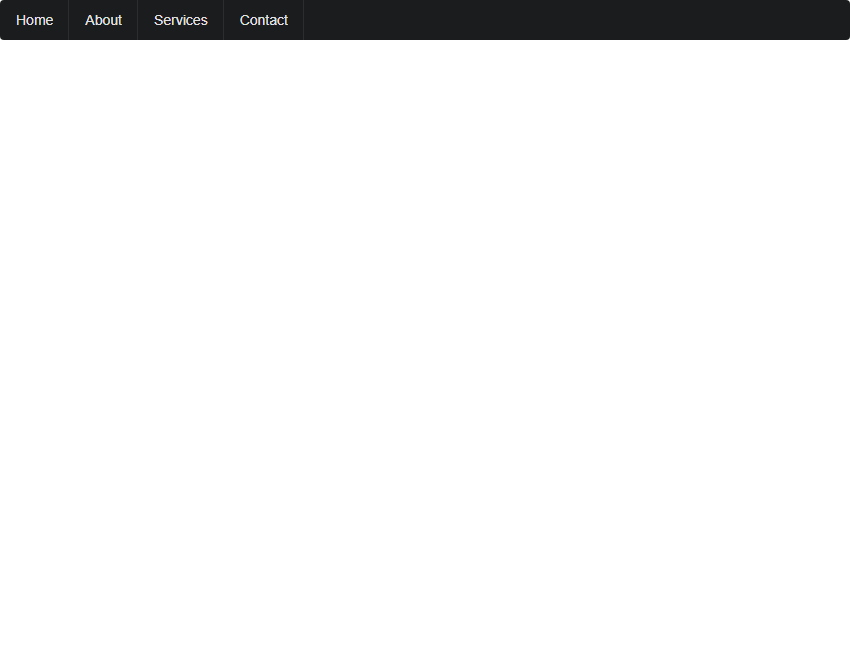
Semantic UI is a modern CSS framework that provides semantic class names, helping developers quickly build readable and maintainable web pages. Here’s a sample code demonstrating how to use Semantic UI’s navigation bar styles:
<!DOCTYPE html>
<html lang="en">
<head>
<meta charset="UTF-8">
<meta name="viewport" content="width=device-width, initial-scale=1.0">
<link rel="stylesheet" href="https://cdn.jsdelivr.net/npm/semantic-ui@2.4.2/dist/semantic.min.css">
<title>Semantic UI Navbar Example</title>
</head>
<body>
<div class="ui inverted menu">
Home
About
Services
Contact
</div>

</body>
</html>
Output:

In the example code above, we import Semantic UI’s CSS file and use the navigation bar styles it provides. After running the code, you should see a navigation bar with inverted colors.
5. Foundation
Foundation is a responsive CSS framework that provides a rich grid system and components to help developers build web pages that adapt to different devices. Here’s a sample code example showing how to use Foundation’s grid system:
<!DOCTYPE html>
<html lang="en">
<head>
<meta charset="UTF-8">
<meta name="viewport" content="width=device-width, initial-scale=1.0">
<link rel="stylesheet" href="https://cdn.jsdelivr.net/npm/foundation-sites@6.6.3/dist/css/foundation.min.css">
<title>Foundation Grid Example</title>
</head>
<body>
<div class="grid-container">
<div class="grid-x grid-padding-x">
<div class="cell small-6 medium-4 large-3">Column 1</div>
<div class="cell small-6 medium-4 large-3">Column 2</div>
<div class="cell small-6 medium-4 large-3">Column 3</div>
<div class="cell small-6 medium-4 large-3">Column 4</div>
</div>
</div>
</body>
</html>
Output:

In the sample code above, we import the Foundation CSS file and use the grid system provided by Foundation. After running the code, you will see a webpage with a multi-column layout.
6. Materialize
Materialize is a CSS framework based on Google’s Material Design. It provides modern styles and components to help developers build web pages in the Material Design style. Below is a sample code demonstrating how to use the Materialize Card component:
<!DOCTYPE html>
<html lang="en">
<head>
<meta charset="UTF-8">
<meta name="viewport" content="width=device-width, initial-scale=1.0">
<link rel="stylesheet" href="https://cdn.jsdelivr.net/npm/materialize-css@1.0.0/dist/css/materialize.min.css">
<title>Materialize Card Example</title>
</head>
<body>
<div class="row">
<div class="col s12 m6">
<div class="card blue-grey darken-1">
<div class="card-content white-text">
<span class="card-title">Card Title</span>
<p>geek-docs.com is a great website!</p>
</div>
</div>
</div>
</div>
</body>
</html>
Output:

In the sample code above, we import the Materialize CSS file and use the card component provided by Materialize. After running the code, you should see a card with a title and content.
7. UIKit
UIKit is a lightweight CSS framework that provides clean, modern styles and components for building simple web pages. Here’s a sample code demonstrating how to use UIKit’s button styles:
<!DOCTYPE html>
<html lang="en">
<head>
<meta charset="UTF-8">
<meta name="viewport" content="width=device-width, initial-scale=1.0">
<link rel="stylesheet" href="https://cdn.jsdelivr.net/npm/uikit@3.7.4/dist/css/uikit.min.css">
<title>UIKit Button Example</title>
</head>
<body>
<button class="uk-button uk-button-primary">Primary Button</button>
<button class="uk-button uk-button-secondary">Secondary Button</button>
<button class="uk-button uk-button-danger">Danger Button</button>
</body>
</html>
Output:

In the example code above, we import UIKit’s CSS file and use the button styles provided by UIKit. After running the code, you should see three buttons with different styles.
8. Spectre.css
Spectre.css is a lightweight CSS framework that provides clean, modern styles, perfect for building simple web pages. Below is a sample code demonstrating how to use Spectre.css form styles:
<!DOCTYPE html>
<html lang="en">
<head>
<meta charset="UTF-8">
<meta name="viewport" content="width=device-width, initial-scale=1.0">
<link rel="stylesheet" href="https://cdn.jsdelivr.net/npm/spectre.css@0.5.10/dist/spectre.min.css">
<title>Spectre.css Form Example</title>
</head>
<body>
<form class="form-horizontal">
<div class="form-group">
<label class="form-label" for="name">Name:</label>
<input class="form-input" type="text" id="name" placeholder="Enter your name">
</div>
<div class="form-group">
<label class="form-label" for="email">Email:</label>
<input class="form-input" type="email" id="email" placeholder="Enter your email">
</div>
<button class="btn btn-primary">Submit</button>
</form>
</body>
</html>
Output:

In the sample code above, we imported the Spectre.css CSS file and used the form styles it provides. After running the code, you should see a form with an input field and a button.
9. Pure CSS
Pure CSS is a lightweight CSS framework that provides clean, modern styles, perfect for building simple web pages. Here’s a sample code demonstrating how to use Pure CSS button styling:
<!DOCTYPE html>
<html lang="en">
<head>
<meta charset="UTF-8">
<meta name="viewport" content="width=device-width, initial-scale=1.0">
<link rel="stylesheet" href="https://cdn.jsdelivr.net/npm/purecss@2.0.5/pure-min.css">
<title>Pure CSS Button Example</title>
</head>
<body>
<button class="pure-button">Default Button</button>
<button class="pure-button pure-button-primary">Primary Button</button>
<button class="pure-button pure-button-secondary">Secondary Button</button>

</body>

</html>
Output:

In the example code above, we import the Pure CSS CSS file and use the button styles provided by Pure CSS. After running the code, you should see three buttons with different styles.
10. Milligram
Milligram is a minimalist CSS framework that provides clean, modern styles, perfect for building simple web pages. Here’s a sample code example showing how to use Milligram’s heading styles:
<!DOCTYPE html>
<html lang="en">
<head>
<meta charset="UTF-8">
<meta name="viewport" content="width=device-width, initial-scale=1.0">
<link rel="stylesheet" href="https://cdn.jsdelivr.net/npm/milligram@1.4.1/dist/milligram.min.css">
<title>Milligram Heading Example</title>
</head>
<body>
<h1 class="title">Welcome to geek-docs.com</h1>
<h2 class="title">Learn CSS styles here</h2>
</body>
</html>
Output:

In the example code above, we import Milligram’s CSS file and use the provided heading styles. After running the code, you can see two different heading styles.